User Guide for
GeoMapApp version 3.3
Andrew Goodwillie
Lamont-Doherty Earth Observatory, Columbia University
Last updated 2nd October 2013
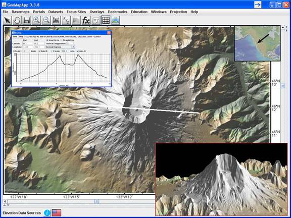
Figure: The GeoMapApp base map reveals striking features of Mt. St. Helens, a stratovolcano in the Cascadia Range. Inset, top left: Profile taken across the summit caldera. Inset, lower right: 3-D perspective plot looking south towards the blasted away northern flank. Resolution of elevation data set is 10m.


2) Download and start GeoMapApp
3) Global Multi-Resolution Topography (GMRT)
4) The Menu Bar - Introduction
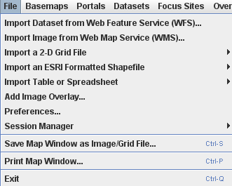
5.1) File
5.2) Basemaps
5.3) Portals
5.3.1) Bathymetry, Gravity and Magnetic Anomaly Profiles
5.3.2) Earthquake Focal Mechanism Solutions (CMT)
5.3.3) Earthquake Locations, Epicenter Depths, Magnitudes (ISC)
5.3.4) Location and Timing of Seafloor Earthquakes and Eruptions
5.3.5) Multibeam Swath Bathymetry
5.3.6) Digital Seismic Reflection Profiles
5.3.7) Ocean Floor Drilling
5.3.8) PetDB (Composition of the Oceanic Volcanic Crust)
5.3.9) Seafloor Magnetic Anomaly Identifiers
5.3.10) Seafloor Photographic Transects (Dive photos)
5.3.11) Analog Seismic Reflection Profiles
5.3.12) Search Expedition Data
5.4) Datasets
5.5) Focus Sites
5.6) Overlays
5.7) Bookmarks
5.8) Education
5.9) Windows
5.10) Projection
5.11) Help
5.12) My Layer Sessions
6.1) Arrow Cursor
6.2) Pan
6.3) Save
6.4) Zoom
6.6) Digitizer
6.7) Shapefile Manager
6.8) Focus
6.9) Mask function
6.10) Show Contributed Grids
6.11) Global Grid Dialog
6.12) Layer Manager
7) Tool tips
8) Text Displayed on the Toolbar
10) Cookbook
10.1) How to Import Data – Spreadsheets
10.2) How to Lasso Data Points
10.3) How to Import Data – Grids
10.4) How to manipulate grids
10.5) How to use the Layer Transparency
10.6) How to Import Data – Shapefiles
10.7) How to Import Data – Shapefiles of grids
10.8) How to use the Tear-Off Menus
10.9) How to move/sort tabular columns
10.10) How to Detach-Attach Tables
11) Miscellaneous
11.1) Loading data sets with many points
11.2) GeoMapApp Image Gallery
11.3) GeoMapApp Built-In Data Holdings
11.4) Contact us, and the GeoMapApp listserv
GeoMapApp is an application created for the discovery, exploration, manipulation, visualization and analysis of a large choice of built-in and user-imported data sets. The application is coded in Java Standard Edition 5 (1.5.0) and runs in most installations of the Windows XP, Vista and Mac OSX operating systems as well as with Solaris and Linux. The application is free and can be downloaded at http://www.geomapapp.org/. The development of GeoMapApp is funded by the US National Science Foundation and the Trustees of Columbia University.
From the GeoMapApp window, users access the many built-in grids, images and tabular data sets via the menu bar which can also be used to import new data sets. The GeoMapApp tool bar provides a number of useful functions and shortcuts, including zoom and panning, a profile tool and mask function, and a digitizer. When viewing grids, the grid dialog pop-up window offers convenient tools for changing the color palette and sun illumination, for drawing contours and creating profiles, and for generating a 3-D perspective view. At all times, GeoMapApp’s layer manager allows layers to be toggled off and on, their transparency altered, and their order switched. For example, varying the transparency is useful when comparing co-located data sets, and, when viewing multiple data sets, the user can specify which layer is topmost. A number of built-in data sets are shapefiles. The shapefile manager allows individual components of built-in and imported multi-shape shapefiles to be selected.
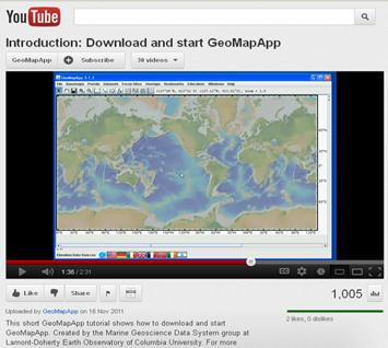
A
collection of short GeoMapApp video tutorials is posted on ![]() , under the GeoMapApp channel, as captured in this
screen shot:
, under the GeoMapApp channel, as captured in this
screen shot:
Also, answers to a list of frequently-asked questions are given on the GeoMapApp web page and are routinely updated.
2) Download and start GeoMapApp
See
video tutorial on ![]()
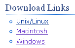
On the GeoMapApp web page (http://www.geomapapp.org/), look in the left margin and choose the platform you are using from the Download Links area.
On the next web page, click Agree and save the application to the local computer. The GeoMapApp icon looks like the image shown below.
![]()
Double-click on the icon to start the application.
Alternatively, if GeoMapApp was downloaded as a jar file (GeoMapApp.jar), it can be opened from a terminal window by changing to the directory containing the application and typing: java -jar -Xmx1028m GeoMapApp.jar In this example, 1028 Mbytes are allocated as application memory (the default is 256 Mbytes). Specifying this larger memory size is useful when importing very large (many 100s MBytes) grids or data sets from the local disk drive.
A third way of opening GeoMapApp is to use a Java WebStart link. The WebStart link – circled in red in the image below – is found on the GeoMapApp home web page:
![]()
2.1) Choosing a Map Projection
When GeoMapApp is opened, the user has a choice of three map projections as shown below, left.
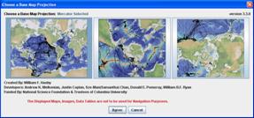
The
Mercator projection – the leftmost panel – is the pre-selected default as shown
by the outlined blue border. Click the center panel for the southern hemisphere
polar projection or the rightmost panel for the northern hemisphere polar
projection. Click the ![]() button to proceed. An
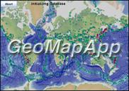
initialisation screen (above, right) is displayed briefly before the GeoMapApp
window appears.
button to proceed. An
initialisation screen (above, right) is displayed briefly before the GeoMapApp
window appears.
Most of the built-in data sets are common to all three projections although some data sets are unique to certain projections.
The Mercator projection conforms to the European Petroleum Survey Group code 3395, the Southern hemisphere polar projection to EPSG code 3031 and the Northern hemisphere projection to EPSG code 32661. The default Mercator projection extends from 81°S to 81°N.
2.2) The GeoMapApp window
After the GeoMapApp window has opened, the default map on display is the shaded color topographic relief from the Global Multi-Resolution Topography (GMRT) compilation of the Marine Geoscience Data System. Here are the three projections.
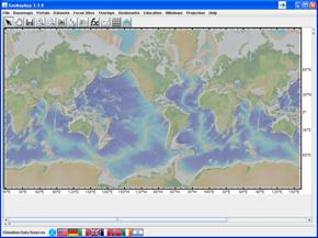
Figure: Mercator projection base map (default)
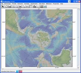
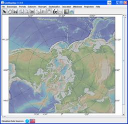
Figure: Southern hemisphere projection Figure: Northern hemisphere projection
3) Global Multi-Resolution Topography (GMRT)
The GMRT compilation (Ryan et al., 2009) includes high-resolution multibeam swath bathymetry (~100m grid spacing throughout the global oceans, with 50m spacing in some shelf areas) and, for land areas, very high resolution elevations from the Shuttle Radar Topography Mission and USGS NED model. For the Mercator and polar projections cleaned multibeam swaths from more than 600 cruises are merged with the 1 arc-minute resolution “predicted bathymetry” of Smith and Sandwell (1997).
In addition, the GMRT compilation for the southern hemisphere polar projection incorporates the BEDMAP 2000 Antarctic under-ice topography of Lythe et al. (2000), and GMRT for the northern hemisphere polar projection uses the digital depths of the International Bathymetric Chart of the Arctic Ocean (IBCAO) of Jakobsson et al. (2008).
· Smith, W. H. F and Sandwell, D.T., 1997. Global seafloor topography from satellite altimetry and ship depth soundings. Science, 277, 1957-1962.
· Lythe, M.B., Vaughan, D.G. and the BEDMAP Consortium, 2000. BEDMAP bed topography of the Antarctic. 1:10,000,000 scale map. BAS (misc) 9. Cambridge, British Antarctic Survey.
· Jakobsson, M.R., Macnab, R., Mayer, L., Anderson, R., Edwards, M., Hatzky, J., Schenke, H.W., and Johnson, P., 2008. An improved bathymetric portrayal of the Arctic Ocean: Implications for ocean modeling and geological, geophysical and oceanographic analysis, Geophys. Res. Lett., doi:10.1029/2008GL033520.
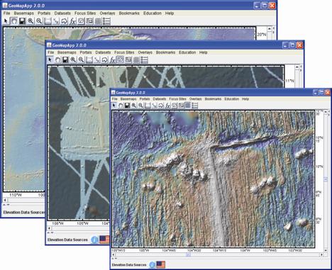
Figure: Examples of the GMRT compilation at the East Pacific Rise 9N site. Progressively higher resolution is shown to the lower right. Middle image: The mask function uses transparency to indicate areas with multibeam swath bathymetry data. Lower Right image: The underlying grid is shaded from the NW and exaggerated to highlight the strong abyssal hill fabric.
4) The Menu Bar - Introduction
Built-in and imported data sets and many other functions are accessed through the menu bar.
![]()
The
File menu (![]() ) provides user import
options for Excel™ spreadsheets, data tables, grids and shapefiles, and offers Web
Service connections to data from a number of national and institutional data
repositories including IRIS, NASA, JPL, UNAVO, NSIDC.
) provides user import
options for Excel™ spreadsheets, data tables, grids and shapefiles, and offers Web
Service connections to data from a number of national and institutional data
repositories including IRIS, NASA, JPL, UNAVO, NSIDC.
The
Basemaps menu (![]() )provides a very wide range
of global, regional and local data set grids, maps and images, each with full
zoom capabilities.
)provides a very wide range
of global, regional and local data set grids, maps and images, each with full
zoom capabilities.
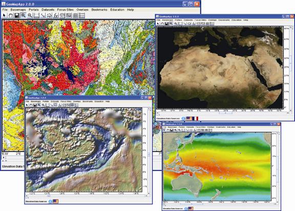
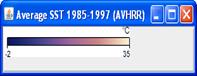
Figure: Examples of base maps available in GeoMapApp (clockwise from upper left): Geology map of France, NASA Blue Marble, AVHRR average sea surface temperatures (1985-1997), Smith-Sandwell satellite altimetry-derived free air gravity anomaly.
The
Portals menu (![]() ) offers customized interfaces
to access and manipulate specific data types. For example, the Digital Seismic
Reflection Profiles interface allows users to view and digitize Multi-Channel
Seismics profiles; the Ocean Floor Drilling interface provides customized core
profiling and searching; the Seafloor Photographic Transects portal offers seafloor
dive photos arranged along dive tracks; and, the Search Expedition Data portal
allows users to search the data holdings for cruises by data type, year
collected and so on..
) offers customized interfaces
to access and manipulate specific data types. For example, the Digital Seismic
Reflection Profiles interface allows users to view and digitize Multi-Channel
Seismics profiles; the Ocean Floor Drilling interface provides customized core
profiling and searching; the Seafloor Photographic Transects portal offers seafloor
dive photos arranged along dive tracks; and, the Search Expedition Data portal
allows users to search the data holdings for cruises by data type, year
collected and so on..
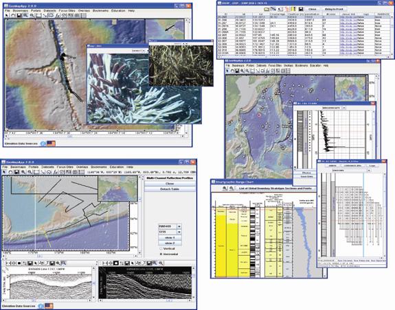
Figure: Examples of customized interfaces available under the Portal menu: (Clockwise from upper left) Seafloor dive photos on high-resolution bathymetry for the EPR 9N Ridge 2000 study site; the DSDP/ODP interface includes species range charts, down-hole physical measurements and stratigraphic information; Multi-Channel Seismic reflection profiles over the Aleutian trench.
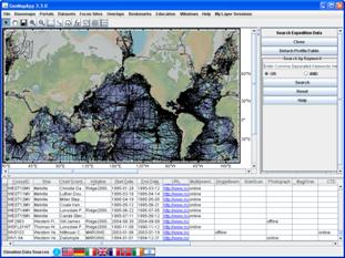
Figure: The new Search Expedition Data portal provides a convenient map interface to search on cruise-related data.
Under
the Datasets menu (![]() ), a large number of
tabular data sets at all scales can be plotted, colored, scaled, graphed, and extracted.
), a large number of
tabular data sets at all scales can be plotted, colored, scaled, graphed, and extracted.
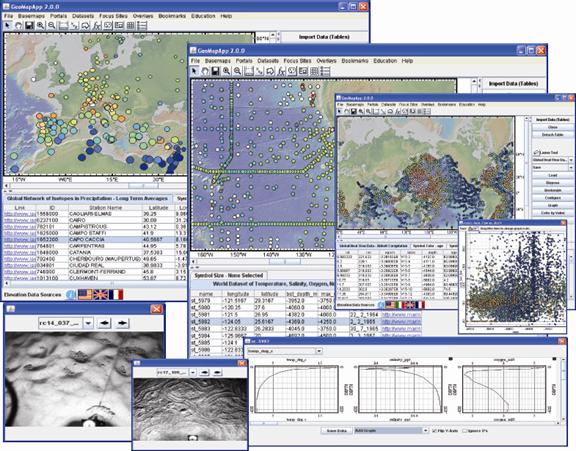
Figure: Examples of Data sets: (Clockwise from upper left) Precipitation isotopes; oceanic water column properties and associated temperature, salinity and oxygen profiles; global heat flow and associated graph of heat flow versus depth; seafloor photos.
The
Focus Sites menu (![]() ) provides quick links to
Ridge 2000, GeoPRISMS and MARGINS Focus Site data sets as well as to data sets
for other selected areas.
) provides quick links to
Ridge 2000, GeoPRISMS and MARGINS Focus Site data sets as well as to data sets
for other selected areas.
In
the Overlays menu (![]() ), various overlays can be
selected and toggled on/off, including a distance scale, the inset map,
coastlines, lakes and rivers, and geographic/political names and boundaries.
), various overlays can be
selected and toggled on/off, including a distance scale, the inset map,
coastlines, lakes and rivers, and geographic/political names and boundaries.
The
Bookmarks menu (![]() ) allows the current view
to be saved as a bookmark, provides zooming capability to user-specified areas,
and a shortcut to zoom out to the global view.
) allows the current view
to be saved as a bookmark, provides zooming capability to user-specified areas,
and a shortcut to zoom out to the global view.
Education-related
links are given under the Education menu (![]() ).
).
The
Windows menu (![]() ) can be used to bring-to-front any of
the GeoMapApp windows currently open.
) can be used to bring-to-front any of
the GeoMapApp windows currently open.
The
Projection menu (![]() ) offers a shortcut to switch from one
GeoMapApp projection to another without needing to close and re-open the
program.
) offers a shortcut to switch from one
GeoMapApp projection to another without needing to close and re-open the
program.
The
Help menu (![]() ) points users to this document, to a
wide range of GeoMapApp video
tutorials
hosted on
) points users to this document, to a
wide range of GeoMapApp video
tutorials
hosted on ![]() , and to other help resources.
, and to other help resources.
When the Sessions Manager is active, a new menu appears at the end of the list:
![]()
The
My Layer Sessions menu (![]() ) is currently under
development. It works with a sessions manager capability to allow basic GeoMapApp
sessions to be saved and later retrieved.
) is currently under
development. It works with a sessions manager capability to allow basic GeoMapApp
sessions to be saved and later retrieved.
In this section are the details of each of the menus.
![]()
Functions
under the File (![]() ) menu include import data
sets and images, save the map window display, and set GeoMapApp preferences.
) menu include import data
sets and images, save the map window display, and set GeoMapApp preferences.
5.1.1) Import data sets – Import Dataset from Web Feature Service (WFS)
Provides real-time web connection to a wide range of database and repository holdings, including those at NGDC, IRIS, the Antarctic Master Directory, the PetDB petrological database and SedDB sediment geochemistry database, DSDP, and others.
When a WFS is loaded, all functionality associated with tabular data sets is available, such as choice of plotting symbol, symbol coloring and scaling, graphing, and lasso selection.
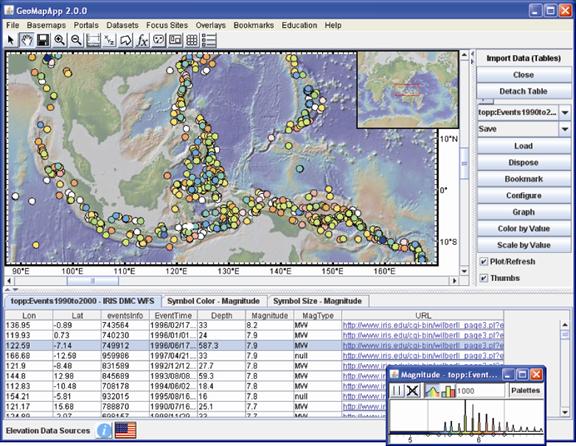
Figure: An IRIS Web Feature Service for earthquake locations showing those around Indonesia, colored according to magnitude.
To graph the down-hole measurements associated with the DSDP WFS, see the data set Special Functionality section.
5.1.2) Import data sets – Import Image from Web Map Service (WMS)
Provides real-time web connection to a number of agencies serving images and maps via WMS, including NASA, JPL and NSIDC. OGC standard WMS versions 1.0.0, 1.1.0, 1.1.1 and 1.3.0 are supported. To specify a particular version, add it to the GetCapabilities URL. Example: http://coastalmap.marine.usgs.gov/cmgp/National/gloria/MapServer/WMSServer?request=GetCapabilities&service=WMS&version=1.3.0
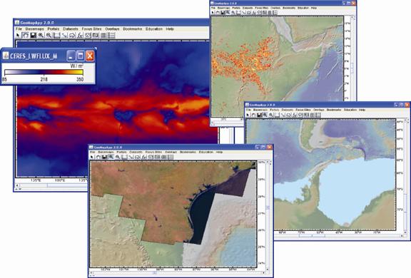
Figure: Web Map Service examples. Clockwise from upper left: Outgoing long wave radiation (NASA, CERES); One month of fires across eastern Africa (NASA, Terra/MODIS); Extent of sea ice in austral summer (NSIDC, for December 1979-2007); Landsat5 pseudo-color mosaic (JPL, CONUS data set).
5.1.3) Import data sets – Import a 2-D Grid File
See
video tutorial on ![]()
With this function, users load their own grids and have full capability for zooming, grid manipulation and profiling. Various formats of grids can be imported, including the GMT netCDF and ESRI ASCII/binary formats. Multiple grids can be imported at once.
5.1.4) Import data sets – Import Shapefile
See
video tutorial on ![]()
Use this option to import shapefiles. The required shapefile components are the .shp, .shx and .dbf files as described here.
5.1.5) Import data sets – Import Table or Spreadsheet
See
video tutorial on ![]()
Users can import data tables that are in ASCII and ExcelTM formats as well as tables stored on the clipboard or at a given web URL. ExcelTM spreadsheets must be in a recent format such as Microsoft 1997-2007 or .xlsx format. The old 5.0/95 format is no longer supported. The data table must contain a column for longitude (in decimal degrees) and a column for latitude (in decimal degrees). The imported points are plotted on the map and can be manipulated as for any data set – colored, scaled, graphed, linked to URLs, and so on.
Additionally, symbol color can be predefined by including a column of Red,Green,Blue values in the data table. The RGB values need to be listed as comma-separated triples such as 255,140,67 and the RGB column is specified in import Config window.
5.1.6) Import data sets – Add Image Overlay
See
video tutorial on ![]()
Imported images are displayed in the GeoMapApp window. The transparency function in the Layer manager can be used to compare the imported image with underlying data sets.
5.1.7) Preferences
The preferences window contains functions that control the border annotation location and style as well as the ability to turn off and on and clear the caching of menus and portal databases.
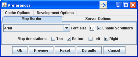
For
border annotations, select the Map Border tab, and tick or untick boxes to turn
items on and off. Select font type from the drop-down menu. Type a new font
size in the box ![]() . To check the appearance
of changes to the annotations, select
. To check the appearance
of changes to the annotations, select ![]() Then, to
accept the changes, select
Then, to
accept the changes, select ![]() .
.
The
caching options, listed under the Cache Options tab ![]() , are turned on by default since they typically
greatly reduce the time taken for GeoMapapp to start and for certain portal
interfaces to load. For example, with no caching, the Multibeam swath
bathymetry portal may take up to 2-3 minutes to fully load. When cached turned
on, it takes just 2-3 seconds.
, are turned on by default since they typically
greatly reduce the time taken for GeoMapapp to start and for certain portal
interfaces to load. For example, with no caching, the Multibeam swath
bathymetry portal may take up to 2-3 minutes to fully load. When cached turned
on, it takes just 2-3 seconds.
The
menus are cached by default but can be cleared with the ![]() button. The next time GeoMapApp is
started a fresh copy of the current menus will be obtained automatically from
the srver.
button. The next time GeoMapApp is
started a fresh copy of the current menus will be obtained automatically from
the srver.
The Server Options and Development Options tabs are for internal use.
Currently under development. It allows GeoMapApp to capture information about which data sets are loaded and what opacity is used to display them. The sessions file can be saved and later retrieved or shared with colleagues. That could be useful in, say, a classroom setting in which an educator requires each student to view a certain sequence of loaded data sets.
The Session manager menu has the following items:
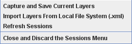
Save
the current display using ![]() The information is
stored in a simple XML file on the local machine.
The information is
stored in a simple XML file on the local machine.
Use
![]() to bring up a navigation window that
provides access to saved sessions. When a saved session has been selected and
imported, a new menu item pops up in the top of the GeoMapApp window:
to bring up a navigation window that
provides access to saved sessions. When a saved session has been selected and
imported, a new menu item pops up in the top of the GeoMapApp window:
![]()
Click
on ![]() to see the list of imported saved
sessions. Each listed item shows the individual component data sets of that
saved session. When one of the component data sets is selected, it is loaded in
GeoMapApp.
to see the list of imported saved
sessions. Each listed item shows the individual component data sets of that
saved session. When one of the component data sets is selected, it is loaded in
GeoMapApp.
![]() will re-read the list of saved
sessions to ensure that it is up-to-date.
will re-read the list of saved
sessions to ensure that it is up-to-date.
![]() removes the
removes the ![]() menu from the top of the GeoMapApp
window.
menu from the top of the GeoMapApp
window.
See also the My Layer Sessions section.
5.1.9) Save Map Window as Image/Grid File
The current map view (including any symbols, grids, tracks and so on that are displayed) can be saved in various image formats including JPEG, PNG, KMZ (Google EarthTM-compatible), and GeoTIFF. The image can also be stored as a PDF file (see Print option below).
The Grid: Higher Resolution Options function allows the base map to be saved in a grid format at various user-specified scales of resolution.
When any grid has been loaded, the range of grid save options includes GMT netCDF, ESRI ASCII/binary, GeoTIFF and the Fledermaus SD formats.
Sends
current map view to printer or to a PDF file. Click Printer ![]() button to choose
destination printer (or PDF file). Paper
orientation and margins can be specified.
button to choose
destination printer (or PDF file). Paper
orientation and margins can be specified.
5.1.11) Exit
Close GeoMapApp.
![]()
A
wide range of global and regional data sets covering many geoscience disciplines
are available through the Basemaps (![]() )menu. New images and
grids are added frequently.
)menu. New images and
grids are added frequently.
Apart from items listed under Global Grids and Regional Grids, which have special functionality, all of the other Basemaps menu choices are images. Note that when grids and images are added to GeoMapApp menus, they are compiled at various resolution scales to allow zooming.
In the Basemaps menu, data sets are grouped roughly into the following categories: geology/geophysics, physical oceanography, land-use/anthropogenic.
Select and click one item from the menu for it to load in the map window. Example:
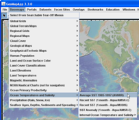
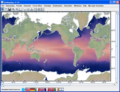
Figure: AVHRR sea surface temperature data set loaded in GeoMapApp. Zoom in to see finer detail.
The map legend appears automatically. The map legend can be resized and moved:
The
Layer Manager, which also opens
automatically, can be used to turn the map window image off and on, to alter
its transparency and to discard it entirely. Note that if the Layer Manager
window is not visible, it can be activated by clicking the ![]() icon in the GeoMapApp toolbar.
icon in the GeoMapApp toolbar.
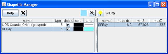
Upon loading an item from either the Global Grids or Regional Grids menu, the grid is loaded in the map window, and a grid dialog window appears. For grids that comprise a multi-shape shapefile, a Shapefile Manager also comes up.
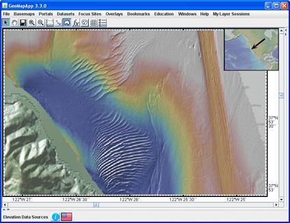
Figure: Very-high-resolution bathymetry of San Francisco Bay showing fine detail on the 2-3m ripples and a 2m-deep dredge channel. Grid is available under Regional Grids > Bathymetry > US Bays, Coast > Other NOS Coastal Grids > NOS Coastal Grids (grouped). Then, in the Shapefile Manager select SF Bay).
The Shapefile Manager allows shapefile components to be selected or discarded.
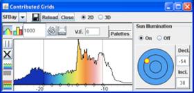
The grid dialog window, shown below, provides functions to manipulate the grid including changing the colors, sun illumination, contours, and taking profiles.
![]()
The Portals menu provides customized interfaces for a number of specific data types shown in the menu below. The expanded functionality of each Portal allows greater data manipulation and access.
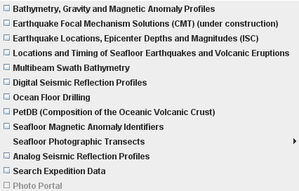
Figure: More than a dozen customized interfaces are offered through the Portals menu.
5.3.1) Bathymetry, Gravity and Magnetic Anomaly Profiles
See
video tutorial on ![]()
This customized interface allows users to view underway geophysical profiles of gravity, magnetics and bathymetry data for more than 8,700 research cruises spanning decades of exploration from the underway collections of NGDC, LDEO, USAP, and SIOExplorer.
Select
this interface from the Portals menu (![]() ) to
display the ship tracks. The default view displays the NGDC holdings of cruise
tracks with any gravity, magnetics or bathymetry data. To select cruises for a
particular data type, use the check boxes to the right of the map: tick only
those boxes for which data is required.
) to
display the ship tracks. The default view displays the NGDC holdings of cruise
tracks with any gravity, magnetics or bathymetry data. To select cruises for a
particular data type, use the check boxes to the right of the map: tick only
those boxes for which data is required.
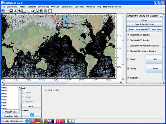
Figure: Use the tick boxes and radio buttons to choose which data collection and data type are displayed on the map.
Zoom
to an area and click on a track of interest. The selected track turns white. Note
that only those cruises falling both within the map area and having the selected
data type are displayed in the cruise list in the lower left. Select View
Profile (![]() ) to load the underway
geophysical data. The track turns yellow. The red part of the track shows the
extent of the profile displayed in the lower pane. Note that it may be
necessary to scroll through the profile window to see profiles for incomplete
data sets.
) to load the underway
geophysical data. The track turns yellow. The red part of the track shows the
extent of the profile displayed in the lower pane. Note that it may be
necessary to scroll through the profile window to see profiles for incomplete
data sets.
Download
the underway geophysical data set in MGD77 format using the Download
Data button (![]() ). Use the
). Use the ![]() button to import an MGD77
file. Select cruises from the collections of NGDC, LDEO, USAP, SIOExplorer by
choosing the radio button in the right pane.
button to import an MGD77
file. Select cruises from the collections of NGDC, LDEO, USAP, SIOExplorer by
choosing the radio button in the right pane.
Save
the map as an image using ![]() >
> ![]() .
.
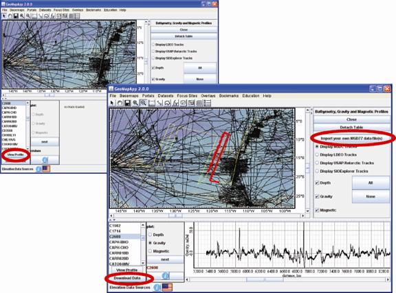
Figure:
(Left) Select a cruise track, click View Profile (![]() ) to display the
profile. (Right) In the lower left pane, once a profile has been loaded, use
the gravity, magnetics, bathymetry radio buttons to display that data set for
the selected track. In the profile pane, use the scroll bar to scroll through
the track data. Circled in red are the functions to download the MGD77 format file or
import your own MGD77 file.
) to display the
profile. (Right) In the lower left pane, once a profile has been loaded, use
the gravity, magnetics, bathymetry radio buttons to display that data set for
the selected track. In the profile pane, use the scroll bar to scroll through
the track data. Circled in red are the functions to download the MGD77 format file or
import your own MGD77 file.
5.3.2) Earthquake Focal Mechanism Solutions (CMT)
Display and explore CMT focal mechanism solutions from the Global CMT Project for almost 35,000 events dating back to 1976.
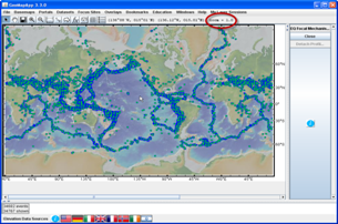
Figure: When the portal is loaded, CMT solutions appear as blue symbols on the map. The moment tensor solution “beachball” images are displayed when the map window zoom factor, listed in the upper right corner of the GeoMapApp window and shown here ringed in red, is equal to or greater than a zoom factor of 32.
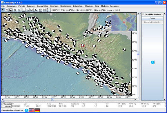
Figure: Screen shot of focal mechanism solutions for the Central America region. Using the cursor, one symbol was selected. It is circled in red near the centre of the map. The solution for that event is listed across the bottom of the GeoMapApp window and gives information on date, time, position, magnitude and nodal plane. The map can be saved under the File > Save map Window menu.
5.3.3) Earthquake Locations, Epicenter Depths and Magnitudes (ISC)
See
video tutorial on ![]()
Display and filter earthquakes from the International Seismological Centre for years 1964-1996.
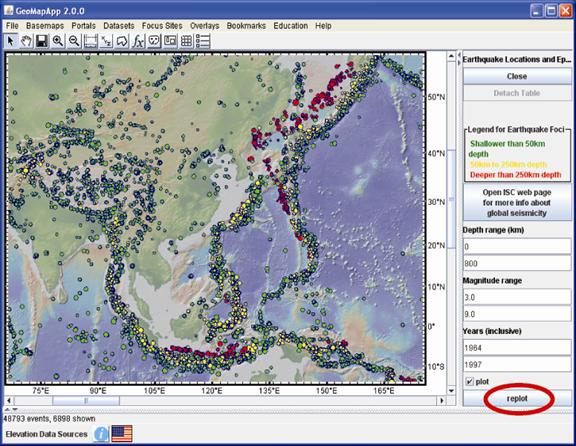
Use
the filters in the right pane for ![]() ,
, ![]() ,
, ![]() to change the displayed
range of earthquake depth, magnitude and year. Click the
to change the displayed
range of earthquake depth, magnitude and year. Click the ![]() button each time a
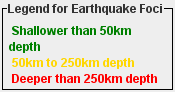
range is adjusted. Epicenters are color-coded as green = shallow, yellow =
intermediate and red = deep.
button each time a
range is adjusted. Epicenters are color-coded as green = shallow, yellow =
intermediate and red = deep.
Save the map as an image using File > Save map Window menu.
5.3.4) Location and Timing of Seafloor Earthquakes and Volcanic Eruptions
See
video tutorial on ![]()
Create movie animations of earthquake activity during user-specified time windows for various NOAA/PMEL data sets.
Three data sets are available: the Sound Surveillance System deep-water array (SOSUS, 17 years of data), East Pacific Rise (EPR, 6 years of data) and Mid-Atlantic Ridge (MAR, 4 years of data).
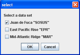
Choose
one of the three data sets by ticking the appropriate box (![]() ) then click
) then click ![]() to load the selected data
set.
to load the selected data
set.
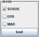
Once
the portal has been loaded, the data set on display can be switched by selecting
it (![]() )from the “areas” box in
the right pane – see image below. Load the new data set by then clicking the
)from the “areas” box in
the right pane – see image below. Load the new data set by then clicking the ![]() button.
button.
The lower pane displays the earthquake activity and the animation parameters.
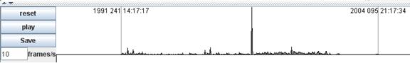
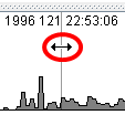
The histogram shows the number of earthquakes (vertical axis) plotted against time (horizontal axis). Change the time range as follows: Move the cursor over one of the grey vertical lines. The cursor becomes a double-headed arrow as shown in the image below. Click and drag the grey vertical lines left or right.
Use
the ![]() button to reset the time period
that is displayed in the histogram window. Date values are given in (year,
day-of-year, time) format. An animation viewing speed of 5 frames/second
usually looks good.
button to reset the time period
that is displayed in the histogram window. Date values are given in (year,
day-of-year, time) format. An animation viewing speed of 5 frames/second
usually looks good. ![]()
Start
the animation with the ![]() button. Save the animation
as an MPEG file with the
button. Save the animation
as an MPEG file with the ![]() button (when choosing a
file name, append “.mov”).
button (when choosing a
file name, append “.mov”).
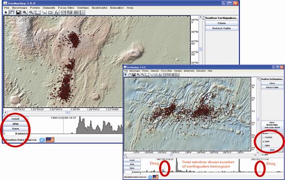
Figure: (Left) Watch an earthquake swarm propagate over ten days in 1998 along the Juan de Fuca ridge axis at 45.75o N. (Right) View two earthquake swarms at the Wilkes Fracture Zone that occurred between 1999-2001. The epicentres are superimposed upon striking EPR axial topography mapped with multibeam echo-sounders.
5.3.5) Multibeam Swath Bathymetry
See
video tutorial on ![]()
Use a map of ship tracks to quickly identify and download multibeam swath data files.
When this portal is loaded, ship tracks are displayed in the map window. Zoom and click on a track of interest. The chosen ship track turns white. The red part of the track shows the extent of the individual swath file for which the file name is listed in the lower left. Note that the red part of the track may be very short depending upon zoom factor and duration of particular swath files.
Use
the ![]() button to download the
selected multibeam swath file in its native format (all are compatible with MB-SYSTEM).
button to download the
selected multibeam swath file in its native format (all are compatible with MB-SYSTEM).
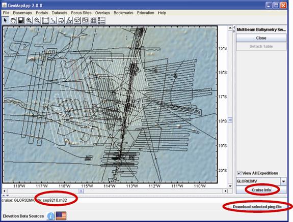
Figure: The individual ping file is coloured red on the map and is listed in the lower left. All other ping files for that particular cruise are drawn in white on the map.
The
![]() button opens the MGDS web
page for this cruise, if available. Save the map as an image using the File
> Save map Window menu.
button opens the MGDS web
page for this cruise, if available. Save the map as an image using the File
> Save map Window menu.
To help speed the loading time of this portal, a caching system has been implemented.
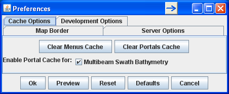
The
caching options, listed under the Cache Options tab, are turned on by default and
when the portal is first loaded, the information is cached locally. Next time
the portal is opened, it will load much quicker, typically about 50x faster.
The cache can be deleted with the ![]() button or disabled
with the
button or disabled
with the ![]() box.
box.
5.3.6) Digital Seismic Reflection Profiles
See
video tutorial on ![]()
Use this interface to view, compare, digitize, annotate, and extract digital Multi-Channel Seismic (MCS) and Single-Channel Seismic (SCS) reflection profiles from four sets of seismic data holdings. There are profiles from more than 120 cruises in the Lamont and UTIG Academic Seismic Portal collections; more than 35 USGS MCS cruises, 170 USGS SCS cruises and about 20 cruises for the Antarctic Seismic Data Library System.
When the portal loads, geographical bounding boxes on the map show the extent of available seismic profiles.
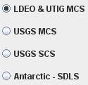
By default, profiles from the Lamont and UTIG MCS holdings are displayed on the map.
To change the data holdings on display, select the appropriate radio button in the right pane, shown here:
Zoom to your area of interest and click inside one of the boxes to display the seismic lines within that geographical bounding box. Each cruise has its own bounding box. In the map window click a line to select it, or use the drop-down menus at right to choose a cruise and a seismic line. The chosen line turns white.
Select
![]() to load the seismic
profile in panel 1. The portion of the seismic profile that is displayed in the
lower panel is shown as red on the map of seismic profile lines. To load a
second line, click on another profile track in the map and select
to load the seismic
profile in panel 1. The portion of the seismic profile that is displayed in the
lower panel is shown as red on the map of seismic profile lines. To load a
second line, click on another profile track in the map and select ![]() . Toggle between
. Toggle between ![]() and
and ![]() to display the profiles side-by-side
or one above the other.
to display the profiles side-by-side
or one above the other.
Scroll
through the seismic profile using the horizontal and vertical scroll bars (![]() ) next to the profiles.
Note that the red portion of the seismic line moves with each horizontal
scrolling action. Zoom in or out of the profile using the zoom buttons
) next to the profiles.
Note that the red portion of the seismic line moves with each horizontal
scrolling action. Zoom in or out of the profile using the zoom buttons ![]() in the profile pane. The
profile axes show two-way travel time in seconds (vertical axis) and Common
Mid-Point gather number (horizontal axis).
in the profile pane. The
profile axes show two-way travel time in seconds (vertical axis) and Common
Mid-Point gather number (horizontal axis).
Flip
the profile laterally using the twin arrows button (![]() ).Switch to inverse video using the
).Switch to inverse video using the ![]() button.
button.
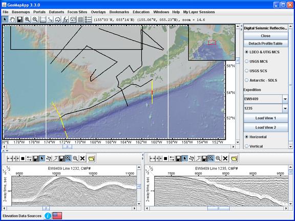
Figure: Comparing two Aleutian Trench MCS profiles that lie 800 km apart. Both are from Ewing cruise EW9409, with line 1232 in the left pane, line 1235 in the right pane.
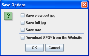
5.3.6.1) Save profile function
Save
the profile on display (“viewport” option) or the entire scanned profile
(“full” option) using the left-most diskette button next to flip-axis button (![]() ). The diskette button (
). The diskette button (![]() ) also allows the seismic
line navigation to be saved, and provides a link to download the SEG-Y file, if available. The options are shown here:
) also allows the seismic
line navigation to be saved, and provides a link to download the SEG-Y file, if available. The options are shown here:
5.3.6.2) MCS digitizing function
Reflector
horizons can be digitized, annotated and saved to a file using the ![]() buttons directly above
the profile display.
buttons directly above
the profile display.
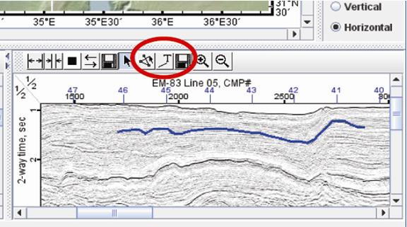
Figure:
Digitized horizon (blue line). The red circle shows the three control buttons
that trigger the Digitize (![]() ), Text annotation
(
), Text annotation
(![]() ) and Save Digitized Points
(
) and Save Digitized Points
(![]() ) functions.
) functions.
Activate
the Digitize function by selecting ![]() . Click firmly
with the mouse to digitize a profile. Exit the digitizer mode by clicking the
adjacent arrow cursor button
. Click firmly
with the mouse to digitize a profile. Exit the digitizer mode by clicking the
adjacent arrow cursor button ![]() . Save the digitized points
with the right-most diskette button (
. Save the digitized points
with the right-most diskette button (![]() ) next to
the profile zoom buttons,
) next to
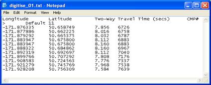
the profile zoom buttons,![]() . The saved ASCII file
contains four tab-separated columns giving longitude, latitude, TWTT, and CMP
number.
. The saved ASCII file
contains four tab-separated columns giving longitude, latitude, TWTT, and CMP
number.
Add
text annotations to the seismic profile by selecting the text (![]() ) button, clicking twice in
the profile window at the desired location, and typing the text in the text box
that pops up, as displayed in this example.
) button, clicking twice in
the profile window at the desired location, and typing the text in the text box
that pops up, as displayed in this example.
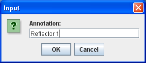
Select
![]() to accept the text.
to accept the text.
5.3.7) Ocean Floor Drilling
See
video tutorials on ![]()
· Physical-Chemical Data and Core Photos
· Geological Timescale, Keeping Track of Age and Depth
The Ocean Drilling portal offers a wealth of data for drill holes of the Deep Sea Drilling Project (DSDP Legs 1-96), the Ocean Drilling Program (ODP Legs 100-210) and the Integrated Ocean Drilling Program (IODP Legs 301-312).
When the portal is selected, the location of all drill holes in those three programs is plotted in the map window. A new window also appears. It displays a scrollable list all of the holes in the current map view.
To select a hole, either click a hole in the map window (turns red), or click a row in the table (turns blue). Multiple holes can be selected by using shift-click in the table.
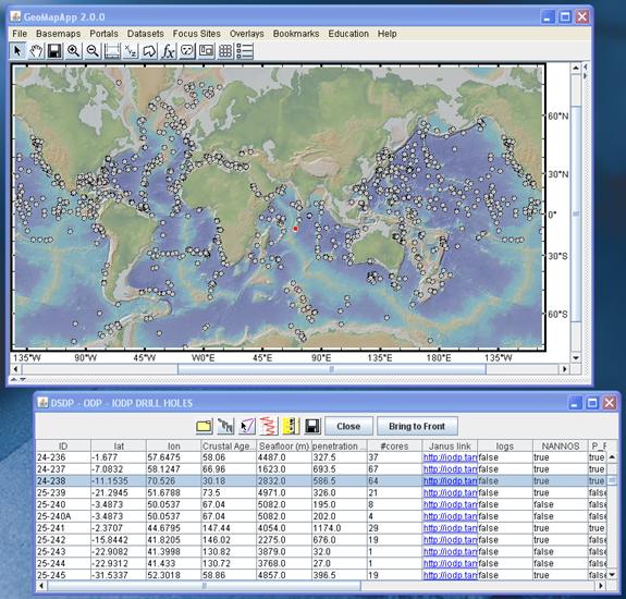
Figure: DSDP hole 24-238 in the central Indian Ocean has been selected. In the map window, the symbol showing its location has turned red, and, in the record table window, the row is highlighted in blue.
Scroll
to the right in the table to see columns of common fauna found in cores
(nannofossils, foraminifera, diatoms, and so on). In those columns, the
“true”/“false” labels indicate the existence of a range chart for that
particular fauna in that particular core. To display all holes with range
charts of, say, diatoms, click twice on the diatom column header ![]() to sort those records and
highlight all holes with diatom range charts. Their locations turn red in the
map window.
to sort those records and
highlight all holes with diatom range charts. Their locations turn red in the
map window.
Figure: Holes with diatom range charts.
Note
that, at times, the drill hole location symbols may be hidden under the symbols
of other data sets or under images of other base maps. Click the ![]() button make them reappear.
button make them reappear.
Click
![]() to exit this DSDP-ODP-IODP
portal.
to exit this DSDP-ODP-IODP
portal.
5.3.7.1) Additional functionality within the Ocean Floor Drilling interface
Enhanced
features are triggered by these icons ![]() in the
DSDP-ODP-IODP tool bar.
in the
DSDP-ODP-IODP tool bar.
5.3.7.2)
Data types folder
![]()
See
video tutorial on ![]()
The
folder icon ![]() opens a new window, as
shown here.
opens a new window, as
shown here.
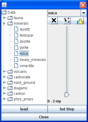
In the left pane is a list of various data types. In the right pane are control parameters, including a slider bar to specify age range.
Choose
a data type from the drop-down menus and press ![]() to
illuminate in the map window all holes reporting that data type within the
specified age range. In the example shown at right, holes with mica in the 0-2
Ma range have been selected.
to
illuminate in the map window all holes reporting that data type within the
specified age range. In the example shown at right, holes with mica in the 0-2
Ma range have been selected.
The
name of the selected data type is given in the upper right corner of the folder
window ![]()
Click
and drag the slider bar ![]() to change the age range.
This allows relative abundances to be visualized through time. The highlighted
holes in the map window change with each chosen age range: only those
containing the selected data type in the specified age range are displayed.
Change the time range increment by clicking the
to change the age range.
This allows relative abundances to be visualized through time. The highlighted
holes in the map window change with each chosen age range: only those
containing the selected data type in the specified age range are displayed.
Change the time range increment by clicking the ![]() button.
button.
Holes
that do not contain that data type in the specified age range can be turned off
and on using the ![]() icon.
icon.
The
color icon ![]() uses a color table to
display the relative percentage of the data type for the chosen age range. Red
indicates high values, blue indicates low values.
uses a color table to
display the relative percentage of the data type for the chosen age range. Red
indicates high values, blue indicates low values.
More
than one data type can be loaded although only one at a time can be visualized.
The loaded data types are listed in the drop-down menu in the upper right.
Switch between loaded data types by selecting them from the drop-down menu.
Click the discard icon ![]() to remove the selected
data type from this list.
to remove the selected
data type from this list.
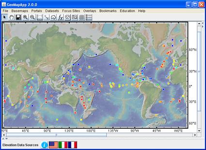
Figure: Colored hole symbols showing the relative abundance of carbonate in the 6-8 Ma time range.
Currently, quantitative measurements are available in GeoMapApp for DSDP legs 1-96.
5.3.7.3)
Faunal Range Charts ![]()
See
video tutorial on ![]()
The
range chart icon ![]() opens a window with faunal
range information.
opens a window with faunal
range information.
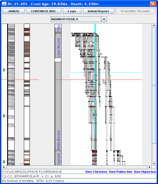
Using
the drop-down menu ![]() choose the type of fauna
and flora to display in the range chart, if reported for the selected hole.
choose the type of fauna
and flora to display in the range chart, if reported for the selected hole.
The graphical part of the window contains four areas.
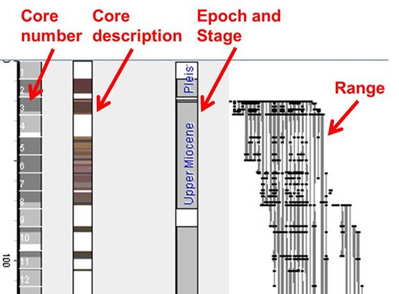
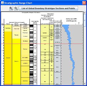
Figure: Range chart structure. On the left, shaded grey boxes show the presence of cores at their respective depths (in meters) below the sea floor. The next column will activate a function that brings up core descriptions. It should be active in a future release of GeoMapApp. In the middle are the epoch and stage ages with name. Faunal ranges are shown on the right, as thin grey vertical lines.
In
the faunal range, black dots (![]() ) represent the core sample
depths.
) represent the core sample
depths.
Click a dot to display information about a species, in the lower part of the window.
In detail, the following information is presented.
·
The
species name (![]() ).
).
·
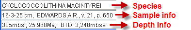
Location
of sample within the core (![]() ). Here, 16-3-25 cm refers
to the core number (16), section (3), and depth in section (25 cm). Followed by
reporting author (A.R. Edwards), report volume (21), and page number (650).
). Here, 16-3-25 cm refers
to the core number (16), section (3), and depth in section (25 cm). Followed by
reporting author (A.R. Edwards), report volume (21), and page number (650).
·
Depth
information (![]() ) lists depth in meters
below sea floor (305 mbsf), age at that depth in millions of years before
present (25.968 Ma). BTD (3248 mbss) gives the back-track depth of the sea floor
of that age expressed in meters below the paleo sea surface (mbss). It
is calculated by removing the thermal subsidence since that time and by
unloading the lithosphere by the weight of the sediments that have accumulated
since that time.
) lists depth in meters
below sea floor (305 mbsf), age at that depth in millions of years before
present (25.968 Ma). BTD (3248 mbss) gives the back-track depth of the sea floor
of that age expressed in meters below the paleo sea surface (mbss). It
is calculated by removing the thermal subsidence since that time and by
unloading the lithosphere by the weight of the sediments that have accumulated
since that time.
·
Further
information contained in external databases about this species is given under
the three hyperlinks (![]() ).
).
The selected species is highlighted in light blue in the range chart. As the cursor is moved in the window, a horizontal red line tracks the cursor giving updated depth/age information.
![]()
The
four buttons ![]() across the top of the
range chart window provide links to more information. The Janus button
across the top of the
range chart window provide links to more information. The Janus button ![]() links to the JANUS
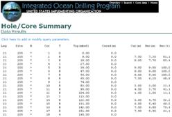
database at Texas A&M University to display the Hole/Core summary results.
links to the JANUS
database at Texas A&M University to display the Hole/Core summary results.
The
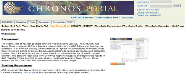
CHRONOS ARC button ![]() goes to the CHRONOS portal
and displays age model information for the selected hole.
goes to the CHRONOS portal
and displays age model information for the selected hole.
.
The Logs button ![]() is
currently inactive.
is
currently inactive.
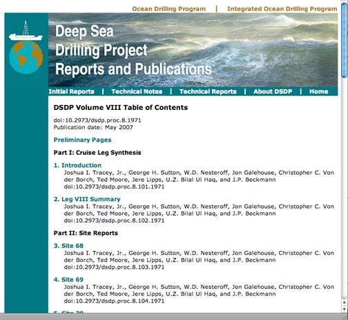
The
Initial Report button ![]() displays the table of
contents and links to chapters of the report for the leg during which the hole
was drilled.
displays the table of
contents and links to chapters of the report for the leg during which the hole
was drilled.
5.3.7.4)
Age-Depth Models
![]()
See
video tutorial on ![]()
When
a hole has been selected, the age-depth model button ![]() opens
a graph in a new window.
opens
a graph in a new window.
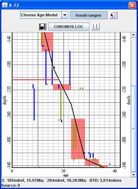
The horizontal axis gives the sediment age, and depth is given in meters below seafloor (mbsf) on the vertical axis. Orange rectangles mark the epoch/stage boundaries. Fossil ranges are shown as blue and green lines. The extent of the blue and green lines defines the first and last occurrence.
As
the cursor moves down the graph, age-depth control points appear as red circles
on the depth-age line. These age-depth values can be saved in a text file using
the save button ![]() .
.
To
change the age range displayed on the horizontal axis move the cursor to hover
over either the left or right vertical axis line. When the cursor symbol
changes to a double-headed arrow, drag the cursor sideways to change the range.
The graph scaling can be reset by clicking the normalizing button ![]() .
.
The
fossil ranges, as defined by their first and last occurrence, are turned off
and on with the ![]() button. The
button. The ![]() button opens a web page
giving CHRONOS portal Line-of-Correlation information.
button opens a web page
giving CHRONOS portal Line-of-Correlation information.
Users
can modify the age-depth model by clicking the ![]() icon.
When active, click on an age-depth control point and drag it with the mouse to
change its age and depth value. To create a new control point, click at the new
location in the graph window. The age-depth curve will instantly adjust to
include this new control point. The new set of age-depth values can be saved in
a text file with the save button
icon.
When active, click on an age-depth control point and drag it with the mouse to
change its age and depth value. To create a new control point, click at the new
location in the graph window. The age-depth curve will instantly adjust to
include this new control point. The new set of age-depth values can be saved in
a text file with the save button ![]() . Clear
the new points with the graph reset button
. Clear
the new points with the graph reset button ![]() .
.
Previously-stored
age-depth models created in earlier GeoMapApp sessions can be accessed using
the drop-down menu at the top of the window, ![]() . The
default age-depth model can be reloaded by selecting “Default” from the
menu. The current age-depth model can also be saved under this menu. The saved
file is stored in the user’s GeoMapApp home directory, or can be stored
elsewhere using the file navigation buttons.
. The
default age-depth model can be reloaded by selecting “Default” from the
menu. The current age-depth model can also be saved under this menu. The saved
file is stored in the user’s GeoMapApp home directory, or can be stored
elsewhere using the file navigation buttons.
The
text display (![]() ) at the base of the graph
lists six pieces of information about the control points and age-depth model –
three values for the control points, and three values for the age-depth model.
From left to right these values are: (a) The number of the control point
nearest the cursor; (b) its depth in meters below seafloor (mbsf); (c) its
assigned age (Ma). These are followed by three values for the age-depth model
at the location of the cursor: (d) the depth in meters below seafloor (mbsf) of
the cursor position; (e) the corresponding sediment age from the age-depth
model (Ma); and, (f) the calculated back-tracked depth (BTD) in meters below
the paleo sea surface (mbss).
) at the base of the graph
lists six pieces of information about the control points and age-depth model –
three values for the control points, and three values for the age-depth model.
From left to right these values are: (a) The number of the control point
nearest the cursor; (b) its depth in meters below seafloor (mbsf); (c) its
assigned age (Ma). These are followed by three values for the age-depth model
at the location of the cursor: (d) the depth in meters below seafloor (mbsf) of
the cursor position; (e) the corresponding sediment age from the age-depth
model (Ma); and, (f) the calculated back-tracked depth (BTD) in meters below
the paleo sea surface (mbss).
5.3.7.5)
Physical-Chemical Measurements Graphs and Core photos ![]()
See
video tutorial on ![]()
For
each drill core, a range of physical and chemical measurements were made on the
recovered core and, in many cases, photos of the cores were taken. These can be
viewed using the graphing function ![]() which
opens a window like this:
which
opens a window like this:
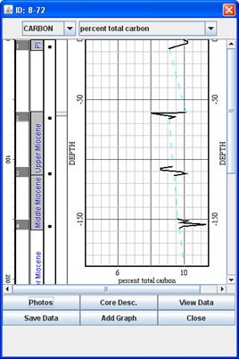
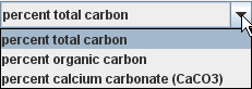
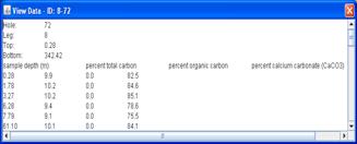
Measured categories are listed in the left-most drop-down menu. Shown in this example is Carbon. Types of measurements within that category are listed in the right-most drop-down menu. Here, “percent total carbon” has been selected and graphed.
The figure below describes the structure of the window.
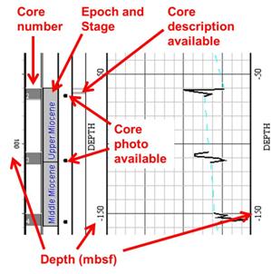
To
access the core photos, click the ![]() button in
the lower left corner of the graph window. A blue column appears in the graph
window between the epoch/stage names and the depth axis.
button in
the lower left corner of the graph window. A blue column appears in the graph
window between the epoch/stage names and the depth axis.
If hand-drawn visual core descriptions are available, another column of squares appears, one for each core section to display the description. Click one of the small black squares to bring up the core photo in a browser window.
The
ASCII data table from which the graph is drawn can be viewed using the ![]() button which opens a text
editor.
button which opens a text
editor.
The
tabular data values are saved to a file using the ![]() button.
button.
Where
a measurement category has multiple data types, the graph for each type can be
viewed side-by-side using the ![]() button. From the pop-up
menus choose the category and data type to plot. A new graph will be plotted
next to the first one as shown below. Individual graphs can be discarded by
clicking the small
button. From the pop-up
menus choose the category and data type to plot. A new graph will be plotted
next to the first one as shown below. Individual graphs can be discarded by
clicking the small ![]() in the upper right corner of each
additional graph.
in the upper right corner of each
additional graph.
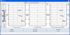
Figure:
Graphs of total carbon, organic carbon and CaCO3 plotted
side-by-side. The new graphs can be deleted by clicking ![]() (upper
right corner).
(upper
right corner).
The
graphing window is discarded with the ![]() button.
button.
5.3.7.6) Geological Timescale
See
video tutorial on ![]()
The
Geological Timescale icon ![]() opens a window displaying
Period, Epoch and Stage boundaries, the geomagnetic polarities time scale and
faunal zonal boundaries for foraminifera and calcareous nannofossils as well as
the delta 18O curve of Zachos et al., 2001.
opens a window displaying
Period, Epoch and Stage boundaries, the geomagnetic polarities time scale and
faunal zonal boundaries for foraminifera and calcareous nannofossils as well as
the delta 18O curve of Zachos et al., 2001.
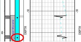
A horizontal red line tracks up and down in this window corresponding to the age of the sediment derived from the age-depth model. This allows the range chart and physical/chemical measurement for the selected hole to be directly correlated with the standard chronology and internationally-recognized epoch/stage boundaries and magnetic reversal time scale.
5.3.7.7) Zooming on graphs
When viewing the graphs (range charts, age-depth graph, and physical-chemical measurements graph) zoom functionality is available: To zoom in, hold down the control key and click the cursor within the graph. To zoom out, hold down the control and shift keys and click the cursor within the graph.
The
Geological Time Scale display includes separate buttons for zooming: ![]()
5.3.7.8) Keeping track of depth in the core section
The vertical position of the cursor creates a horizontal red line that moves in synchronization in all the windows to indicate the same depth below the seafloor. This can assist in correlation between the various data types being graphed. Even if graphs have been zoomed, the red line still shows the corresponding depth in each graph.
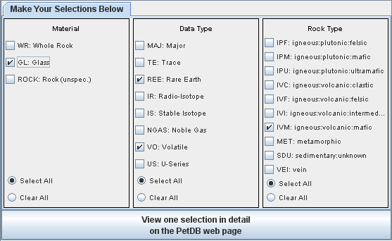
5.3.8) PetDB (Composition of the Oceanic Volcanic Crust)
Explore geochemical analyses and sample locations for samples in the PetDB petrological database. When selected, PetDB sample locations are plotted as squares on the map.
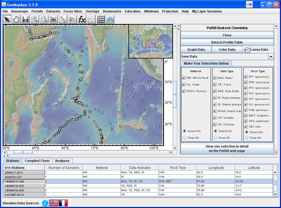
5.3.8.1) Overview
Click
a symbol on the map (it turns red); the data record for this symbol is
highlighted in the lower table. When the Stations tab is active ![]() the columns in the table list the
following information:
the columns in the table list the
following information:
![]() - Number of samples associated with
the chosen station
- Number of samples associated with
the chosen station
![]() - Type of material
analyzed. Codes are listed in right panel (
- Type of material
analyzed. Codes are listed in right panel (![]() )
)
![]() - Data type codes are listed in right
panel (
- Data type codes are listed in right
panel (![]() )
)
![]() - Type of rock
analyzed. Codes are listed in right panel (
- Type of rock
analyzed. Codes are listed in right panel (![]() )
)
![]() - Coordinates of
sample location.
- Coordinates of
sample location.
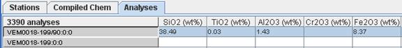
The
Analyses tab ![]() lists the individual geochemical
analyses for each sample associated with the chosen station. Click the column
heading to sort the values.
lists the individual geochemical
analyses for each sample associated with the chosen station. Click the column
heading to sort the values.
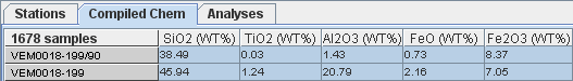
The
Compiled Chem tab ![]() lists the compiled
geochemistry analyses for all samples associated with the chosen station. Click
the column heading to sort the values.
lists the compiled
geochemistry analyses for all samples associated with the chosen station. Click
the column heading to sort the values.
5.3.8.2) Filtering the PetDB samples
By
default, all samples are displayed. The right-hand panel provides the
capability to filter the samples by type of material, type of data, and type of
rock. Click the tick box of an item in the list to select (![]() ) or de-select (
) or de-select (![]() ) it. Click
) it. Click ![]() to de-select all items; click
to de-select all items; click ![]() to select all items.
to select all items.
In the following example, basaltic glasses with REE and volatiles analyses have been manually selected. Only those samples that satisfy these parameters are plotted on the map.
The
PetDB web page for the selected samples can be accessed by clicking this
button: ![]()
5.3.8.3) Color, Graph and Lasso data
The
![]() button opens a window in
which the column to color is chosen from the list.
button opens a window in
which the column to color is chosen from the list.
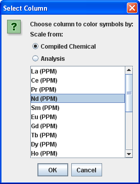
Select
an item (in the example shown above we chose Nd). Click ![]() to
open the color palette histogram.
to
open the color palette histogram.
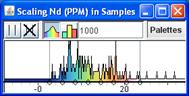
Slide the grey lines in the color histogram to the left or right to change the symbol color range displayed in the map window.
To
plot any two numerical columns, click ![]() and select
the x-axis and y-axis variables from the drop-down lists. If symbols have been
colored (on any column) that coloration is preserved in the graph.
and select
the x-axis and y-axis variables from the drop-down lists. If symbols have been
colored (on any column) that coloration is preserved in the graph.
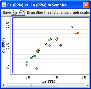
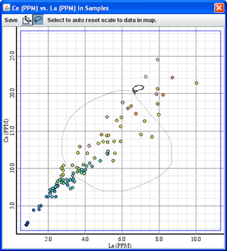
Figure: Compiled chemistry for sample 208NMNH113716: Graph shows Ce plotted against La, with coloring on Nd.
In the Graph window, the axes can be re-scaled as follows: Move the cursor onto a blue line near the graph edge. When the cursor turns into a double-headed arrow, drag the cursor left or right. The axis will rescale instantly.
The
Lasso Tool is found in both the right-hand panel
(![]() ) and in the graph window (
) and in the graph window (![]() ). It is used to capture
specific samples of interest. Click the symbol to activate the Lasso Tool then
use the cursor and free-hand drawing to draw a line that captures points of
interest. The Lassoing can be done in either the map window or in the Graph
window, as shown here.
). It is used to capture
specific samples of interest. Click the symbol to activate the Lasso Tool then
use the cursor and free-hand drawing to draw a line that captures points of
interest. The Lassoing can be done in either the map window or in the Graph
window, as shown here.
When the cursor is released, all of the selected samples are highlighted in the table in blue, and the selected points are ringed in red in both the map window and the Graph window.
PetDB
data can be saved using the options listed in the right pane under the ![]() button.
button.
See this section for more information on coloring and graphing data points.
5.3.9) Seafloor Magnetic Anomaly Identifiers
See
video tutorial on ![]()
Explore isochrons of seafloor magnetic anomalies using Mueller et al’s 1997 data set.
When the portal interface has loaded, zoom and select an isochron of interest. Two things happen: The selected isochron turns white in the map window, and the isochron name and age are displayed in the lower left.
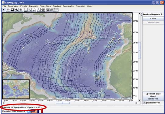
Figure: Isochrons in the north Atlantic. Anomaly 18 has been selected.
Click
on the web page link ![]() to open an information
page describing the data set. The isochrons can be turned off and on by
ticking/unticking the
to open an information
page describing the data set. The isochrons can be turned off and on by
ticking/unticking the ![]() box.
box.
Education suggestion: The magnetic isochron interface can be combined with the profile-distance tool to determine distance and age from a spreading ridge, and thus the spreading rate.
Data set reference: Müller, R.D., Roest, W.R., Royer, J.-Y., Gahagan, L.M. and Sclater, J.G., 1997, Digital isochrons of the world's ocean floor, Journal of Geophysical Research, 102, 3211-3214.
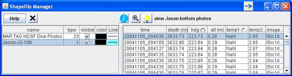
5.3.10) Seafloor Photographic Transects
This portal provides still photographs from the dives of deep sea vehicles Alvin and Jason operated by Woods Hole’s National Deep Submergence Facility. The track of each dive is displayed in the GeoMapApp map window and separate windows are used to view the dive photos.
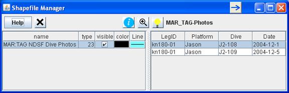
The menu list is grouped by geographical area. After choosing one dive from the menu, a Shapefile Manager window appears. The right pane lists the available dives for that area.
Click
to highlight one of the dive records then click the light bulb ![]() to list all photos
available for that dive (change the column width by dragging the column borders
sideways):
to list all photos
available for that dive (change the column width by dragging the column borders
sideways):
Click
the light bulb ![]() to open a photo display
window. Alvin carries two cameras so the light bulb can be clicked twice to
bring up two photo viewing windows. Jason has four cameras and four clicks
produces four viewing photo windows.
to open a photo display
window. Alvin carries two cameras so the light bulb can be clicked twice to
bring up two photo viewing windows. Jason has four cameras and four clicks
produces four viewing photo windows.
For
each photo display window, use the drop-down menu ![]() at the top to select the camera and
use the arrow buttons
at the top to select the camera and
use the arrow buttons ![]() to scroll through the available photographs.
With each click the photos displayed in all windows are changed. To jump to a
particular time, click the corresponding row in the right pane of the Shapefile
Manager.
to scroll through the available photographs.
With each click the photos displayed in all windows are changed. To jump to a
particular time, click the corresponding row in the right pane of the Shapefile
Manager.
The
![]() zoom function will zoom the map to
the area of the selected dive. The
zoom function will zoom the map to
the area of the selected dive. The ![]() button opens a web
page containing more information about the parent cruise.
button opens a web
page containing more information about the parent cruise.
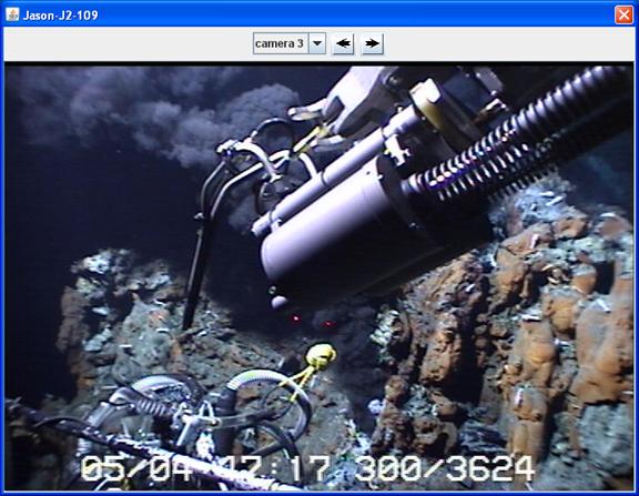
Figure: Example of a dive seafloor photo in this case collected with the WHOI NDSF Jason II ROV during cruise KN180-01 to the Mid-Atlantic Ridge TAG hydrothermal site.
Additional
dives can be loaded. They will appear as layers in the left side of the
Shapefile Manager and only photos from the selected dive will be displayed. The
shapefile can be toggled on and off using the visibility buttons ![]()
![]() .
Discard the shapefile using
.
Discard the shapefile using ![]() .
.
For the five Alvin dives listed for the New England Canyons, the photo locations are presented in the same interface used for tabular data, as shown in the example below.
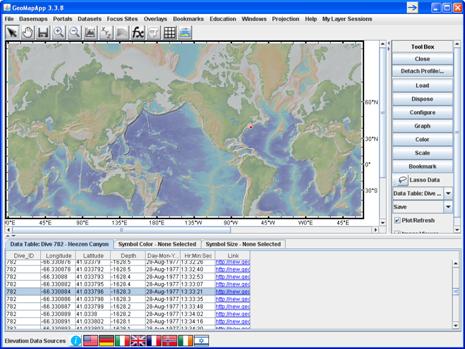
Click
any row in the table or any dot on the map to generate a thumbnail image of the
photograph at that locality and use the arrow buttons ![]() to scroll through the available
photographs.
to scroll through the available
photographs.
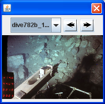
Click a hyperlink in the Links column in the table to display the full-resolution image in a web browser.
5.3.11) Analog Seismic Reflection Profiles
As part of a data rescue effort, about 260 scanned Single-Channel Seismic (SCS) reflection profiles can be viewed, digitized, annotated and extracted using this interface. The profiles were collected on cruises of Lamont-Doherty’s research vessels Robert D. Conrad (for the years 1963-1978), Eltanin (1965-1972) and Vema (1960-1980).
There are two ways to view a profile. Either, click on a track line in the map window. The selected cruise track turns white and its name is highlighted in the cruise list at right. Or, click on a cruise name from the list at right. Note that all of the SCS cruises remain in the list when zooming or panning.
Once
a track has been selected, click ![]() to load
the SCS profile in the lower pane. The vertical axis gives two-way travel time
in seconds. The horizontal axis is distance along profile. The length of
profile shown in the lower pane is displayed in red on the track map.
to load
the SCS profile in the lower pane. The vertical axis gives two-way travel time
in seconds. The horizontal axis is distance along profile. The length of
profile shown in the lower pane is displayed in red on the track map.
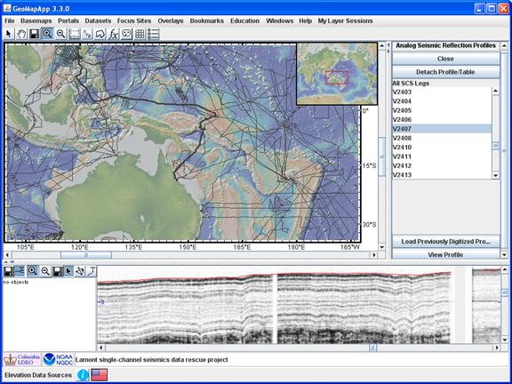
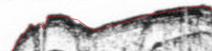
Figure: Reflectors in the SCS profile for 1967 western Pacific Vema cruise V2407, around (157.2E, 1S). The thin red line at the top of the reflectors represents PDR depth.
The
thin red line that appears at the top of the reflection profile – see example
image below – is the seafloor depth taken from the precision depth recorder
(PDR) data. This line delineating PDR seafloor depth can be turned off and on
by clicking the toolbar PDR button: ![]() is on,
and
is on,
and ![]() is off.
is off.
5.3.11.1) SCS save profile function
Save
the profile on display – or the entire scanned profile – using the right-most
diskette button (![]() ) located between the
profile zoom buttons,
) located between the
profile zoom buttons,![]() and the cursor button,
and the cursor button, ![]() .
.
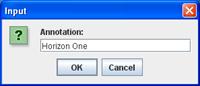
5.3.11.2) SCS digitizing function
Reflector
horizons can be digitized, annotated and saved to a file using the ![]() buttons to the left of the
SCS profile display. Activate the Digitize function by selecting
buttons to the left of the
SCS profile display. Activate the Digitize function by selecting ![]() . Click firmly with the
mouse to digitize each point, and exit the digitizer by clicking the adjacent
arrow cursor button
. Click firmly with the
mouse to digitize each point, and exit the digitizer by clicking the adjacent
arrow cursor button ![]() . Save the digitized points
with the left-most diskette button
. Save the digitized points
with the left-most diskette button ![]() (next to
the
(next to
the ![]() button). Annotate with the
text (
button). Annotate with the
text (![]() ) button by clicking twice
in the profile window and typing text in the text box that pops up.
) button by clicking twice
in the profile window and typing text in the text box that pops up.
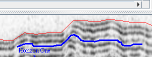
Here is an example of a digitized, annotated reflector:
Summary
of buttons controlling SCS profile options: ![]() . From left to right:
Save digitized points
. From left to right:
Save digitized points ![]() ; Turn off/on PDR seafloor
depth
; Turn off/on PDR seafloor
depth ![]() ; Zoom in
; Zoom in ![]() ; Zoom out
; Zoom out ![]() ; Save profile image
; Save profile image ![]() ; Pointer
; Pointer ![]() ; Digitizer
; Digitizer ![]() ; Text annotation
; Text annotation ![]() .
.
5.3.11.3) Note on zooming in the SCS profile window
If
the zoom in (![]() ) or zoom out (
) or zoom out (![]() ) button is active, it can
be deactivated only by clicking the same button again. The background color
of the button indicates zoom active (darker color
) button is active, it can
be deactivated only by clicking the same button again. The background color
of the button indicates zoom active (darker color ![]() )
or inactive (lighter color
)
or inactive (lighter color ![]() ).
).
5.3.12) Search Expedition Data
See
video tutorial on ![]()
This portal allows searching of data associated with more than 2,200 field programs and data compilations in the MGDS database.
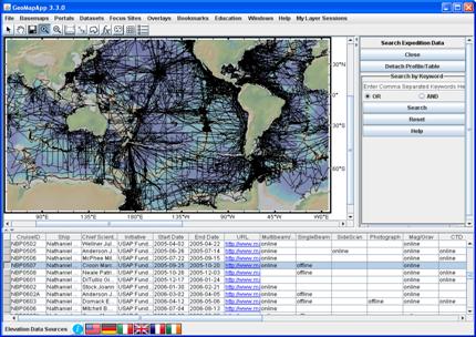
Select a cruise track in the map window by clicking on an individual track line with the cursor. The track will turn white and the cruise record is highlighted in the record table beneath the map. Alternatively, select a row from the table – the record is highlighted and the cruise track will turn white in the map window.
Only records for cruise tracks falling within the displayed map area are listed in the table. Columns can be sorted by clicking the column header. The width of columns is changed by dragging the column header boundary left or right.
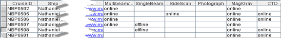
In addition to basic information about the field programs, the columns in the right side of the table, as displayed in the image above, report the status of cruise-related data. The columns are coded as follows:
·
“online”:
Data files are available on-line by clicking the URL link in the ![]() column.
column.
· “offline”: Data files are currently unavailable.
·
blank
cell (![]() ): No data collected.
): No data collected.
BOOLEAN-based searching for data is done using the controls in the right pane. Comma-separated search terms are typed into the text box.
In
the example below, only those cruises collecting Multibeam and Gravity data
during year 2001 will be displayed when the ![]() button is clicked.
button is clicked.
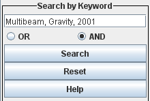
Selecting
instead the ![]() radio button would return all cruises
that collected Multibeam or collected Gravity data or operated during year
2001.
radio button would return all cruises
that collected Multibeam or collected Gravity data or operated during year
2001.
See video tutorial on ![]()
![]()
A
wide range of tabulated data covering many aspects of geophysics, geology,
physical oceanography, palaeo-climates and much more is available under the
Datasets menu (![]() ). New data sets are added regularly.
). New data sets are added regularly.
Common to all of these tabular data sets is that each is geographically-referenced by longitude and latitude. This allows individual points to be queried.
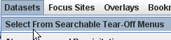
Under the Datasets menu, either follow the cascading menus or tear off the menu for easier navigating.
Once a data set has been identified from the menus, click the name of the data set to load it.
For large data sets, GeoMapApp displays a notice if there are more than 10,000 points.
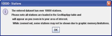
All of the points are loaded in GeoMapApp’s memory but only 10,000 will be displayed in the map window. These displayed points are chosen to be representative of the geographical distribution of the entire data set. Upon zooming in, more of the points become visible.
Once
the data set has loaded, points can be selected either by clicking one row in
the table (row turns blue, example: ![]() ) or by
clicking one of the grey dots on the map which, in turn, will highlight the
corresponding record in the table.
) or by
clicking one of the grey dots on the map which, in turn, will highlight the
corresponding record in the table.
![]()
To
select more than one point, either shift-click to select multiple consecutive
points in the table, ctrl-click to select multiple non-consecutive points in
the table, or, use the Lasso Tool (![]() ) and draw around points on
the map.
) and draw around points on
the map.
Some tabular data sets contain many columns so scroll to the right in the table to see all of the cells. Many of the data set tables contain URL hyperlinks to more information. The link is often given at the end of the row so scroll to the right.
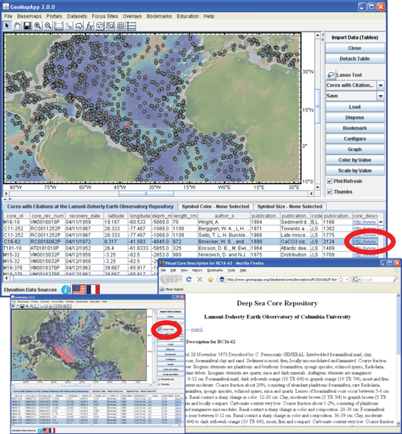
Figure:
Example of built-in data set: Lamont Core Repository data tables (clockwise
from top left): After selecting one point (highlighted as a red dot north of
Brazil), the URL at the end of the row opens a web page containing more information
(bottom right). The Lasso Tool (![]() ) is used to select
multiple points (an example is lower left where all selected points are circled
in red).
) is used to select
multiple points (an example is lower left where all selected points are circled
in red).
Basic functions allow numerical columns in the built-in or imported data sets to be manipulated, including colored by value, scaled, and graphed.
When
symbols are colored, the color histogram window offers a ![]() button. Clicking the button generates
a color legend in a separate window. The legend can be saved as a JPEG image with
the
button. Clicking the button generates
a color legend in a separate window. The legend can be saved as a JPEG image with
the ![]() button.
button.
See
video tutorial on ![]() and here for examples of manipulating data sets.
and here for examples of manipulating data sets.
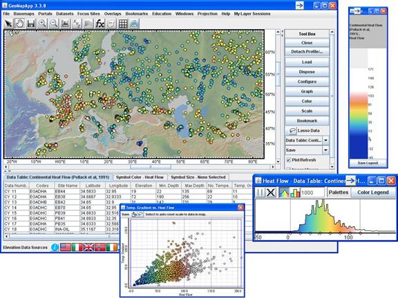
Figure: Example of built-in data set: Global continental heatflow from Pollack et al. 1991 compilation. (Clockwise from top left) Data points have been colored according to one of the numerical values, in this case heatflow value (mW/m2). The colors are easily changed by moving the grey vertical lines in the color histogram window (lower right). A color legend is displayed in a separate window (upper right). Graph of two numerical columns, here heatflow against temperature gradient (bottom).
These data set manipulation functions apply to the built-in tabular data sets and to any imported tabular data set.
Under
the Datasets menu, the Water Column Properties -> World
Data set of Temperature, Salinity, Oxygen, Nutrient Profiles (Reid and Mantyla,
1994) data records are each associated with a number of water column
properties. Click once on a URL in the ![]() column to
display the water column properties as a table in a web browser.
column to
display the water column properties as a table in a web browser.
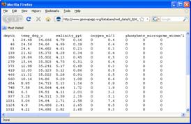
To plot these properties as profiles, select one record in the table and control-shift-click on the URL (hold down the control and shift keys, and at the same time click the URL with the mouse). This brings up a separate graph window.
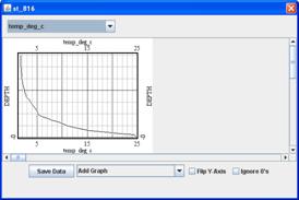
The
y-axis can be flipped (![]() ) to put the sea surface at
the top.
) to put the sea surface at
the top.
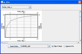
To
compare profiles side-by-side, select the Add Graph menu (![]() ) and choose which
parameter to plot. The new graph can be deleted by clicking
) and choose which
parameter to plot. The new graph can be deleted by clicking ![]() (upper right corner). Add
more graphs as needed. The water column values can be saved to a tabular text
file (
(upper right corner). Add
more graphs as needed. The water column values can be saved to a tabular text
file (![]() button).
button).
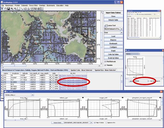
Figure:
Reid and Mantyla’s water column properties compilation interface offers
enhanced functionality. Click once on the URL to open the table of data (upper
right). Press control-shift-click on the URL to open the graphing window (right
middle). Flip the y-axis (![]() ) to put the ocean surface
at the top of the graph, and add more graphs (
) to put the ocean surface
at the top of the graph, and add more graphs (![]() ). Multiple profiles are plotted
side-by-side (bottom).
). Multiple profiles are plotted
side-by-side (bottom).
![]()
This menu provides quick links to data and information for the GeoPRISMS, MARGINS and Ridge 2000 focus sites.
Examples of available data and information include: field rock/bio/fluid sample descriptions, field station and instrument locations, geochemistry data and EarthChem tables, vehicle dive photos, high-resolution multibeam bathymetry grids, seismic interpretations, plate boundaries and grids of magnetisation. When viewing vehicle dive photos under the Focus Site menu, refer to the Seafloor Photographic Transects section.
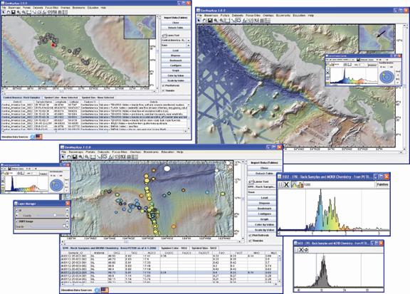
Figure: Examples of focus site data sets available directly from the Focus Sites menu. (Upper left: Central America rock samples giving collection information and field descriptions. (Upper right: Weinrebe’s 2008 multibeam bathymetry compilation grid covering the Costa Rican margin, with sun illumination from the NW. (Bottom: At the Ridge 2000 EPR 9N study site, the seismic layer thickness grid of Canales et al. (2003) is made semi-transparent and overlain on the underlying multibeam bathymetry. PetDB rock sample analyses are colored by TiO2 value and scaled by silica content.
![]()
Look in the Overlays menu to find scale bars for the map distance and color, as well as coastlines, lakes, rivers and geographical boundaries, and inset map controls. Toggle a feature on and off by selecting it in the menu.
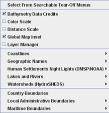
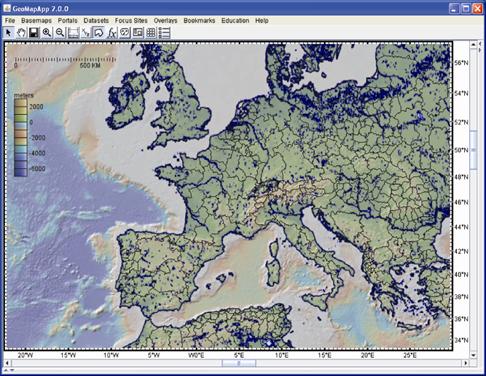
Figure: Overlain on this view of Europe are major lakes and rivers, coastlines, province boundaries, a color scale bar and a distance scale. The inset map and bathymetry credits have been turned off. The distance scale is latitude-dependent and automatically changes when the cursor is used to move the scale to a different position.
Some
Overlay menu selections under Country Boundaries and Local Administrative
Boundaries are controlled by a Shapefile Manager window which allows
added functionality. If the Shapefile Manager does not automatically appear,
click the Shapefile Manager icon ![]() in the tool bar.
in the tool bar.
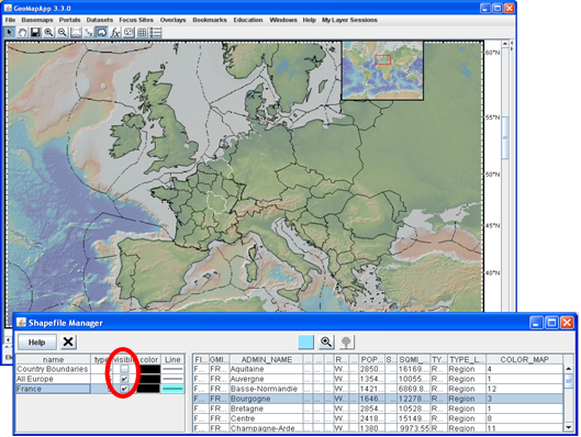
Figure: Using the Shapefile Manager window, the province of Bourgogne and the country of Belgium have been highlighted. The 200 n. mile EEZ limits are also shown.
In
the above image, three boundary data sets have been loaded. They are listed in
the left pane. The ![]() box turns the layer on
and off. In the example, two are displayed. The shape file that is currently
active is highlighted in blue (here,
box turns the layer on
and off. In the example, two are displayed. The shape file that is currently
active is highlighted in blue (here, ![]() ).
).
The
shapefile components are listed in the right pane. Click one of these
components (here, ![]() ) to illuminate that feature on the
map.
) to illuminate that feature on the
map.
The
Layer Manager tool (rightmost icon,![]() , in tool bar) contains a
tick box that turns the layer on and off (
, in tool bar) contains a
tick box that turns the layer on and off (![]() ), discards the layer
(
), discards the layer
(![]() ), and allows the layer transparency to be altered via the slider bar
), and allows the layer transparency to be altered via the slider bar ![]() .
.
![]()
The Bookmarks function allows users to specify the boundaries of predetermined geographical regions. Bookmarked places can be opened in future GeoMapApp sessions.
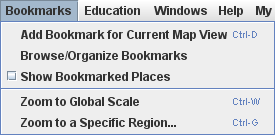
5.7.1) Create a bookmark for the displayed map region
Use
![]() to create a bookmark the map region
currently on display. The name for the bookmark is typed in the text box.
to create a bookmark the map region
currently on display. The name for the bookmark is typed in the text box.
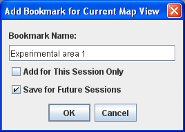
By
default the bookmark will be temporary. Select ![]() to make the bookmark
available for future GeoMapApp sessions.
to make the bookmark
available for future GeoMapApp sessions.
Bookmarked
places are accessed in two ways. Click on ![]() to bring up a
navigation window listing the bookmarks. When a bookmark is selected, the map
automatically zooms to that geographical region. The second way is to click on
the
to bring up a
navigation window listing the bookmarks. When a bookmark is selected, the map
automatically zooms to that geographical region. The second way is to click on
the ![]() menu item. All bookmarked places are
shown as rectangles on the map. Click in one of the rectangles to automatically
zoom to that area.
menu item. All bookmarked places are
shown as rectangles on the map. Click in one of the rectangles to automatically
zoom to that area.
5.7.2) Zoom to a specific geographical region
When
![]() is selected, the N, E, S, W
boundaries are specified in the window that pops up. Note that the format is
either decimal degrees or degrees minutes seconds. In either format, use
negative for south or west values.
is selected, the N, E, S, W
boundaries are specified in the window that pops up. Note that the format is
either decimal degrees or degrees minutes seconds. In either format, use
negative for south or west values.
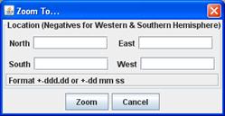
When the map has zoomed to the new place, note that the map area on display may not correspond exactly to the specified boundaries – the map is fitted into the aspect ratio of the GeoMapApp window.
The new area on display can be bookmarked using the steps given above. Many bookmarks can be added to the GeoMapApp menu by repeating these steps.
To
delete a bookmark, use the ![]() menu, select the
bookrmark for deletion, and hit
menu, select the
bookrmark for deletion, and hit ![]() .
.
For those interested, bookmarks are stored in a text file called My Saved Places.loc in a folder called places which is stored in the hidden .GMA folder.
5.7.3) Zoom to the world map
Return
to the world map view using the menu item called ![]() .
.
![]()
This menu provides links to various education web resources related to GeoMapApp:
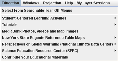
For
example, under ![]() are listed
classroom-ready, freely-available, teacher-tested learning modules centred
around GeoMapApp. They range in scope from middle school concepts to graduate
student level.
are listed
classroom-ready, freely-available, teacher-tested learning modules centred
around GeoMapApp. They range in scope from middle school concepts to graduate
student level.
![]()
The Windows menu lists all GeoMapApp function windows that are currently open and offers a quick way to bring them to the front. When one of the windows is selected from the list, it is automatically brought forwards.
![]()
Three map projections are currently offered in GeoMapApp: Mercator, south polar, north polar. The Projection menu offers a one-click way to switch from the current displayed projection to another without needing to close and re-open the program.
![]()
Links to help documents, web pages and multimedia GeoMapApp tutorials are found here. Users can also provide comments and feedback, and sign up for the GeoMapApp announcements e-mail list.
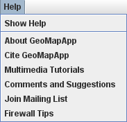
![]()
This
menu exists only when the Sessions Manager is active. It provides
access to the imported saved sessions. Use ![]() to import additional
sessions. The
to import additional
sessions. The ![]() button refreshes the list of locally-saved
sessions. Here’s an example of the menu:
button refreshes the list of locally-saved
sessions. Here’s an example of the menu:
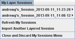
In this example, two saved sessions have been imported. Moving the cursor over a saved session reveals its component layers. To help keep track of saved layers, each saved layer is associated with a color which is also displayed in the Layer Manager. In the following example, the data set is tagged with an orange color
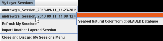
which is also displayed near the right edge of the Layer Manager window:
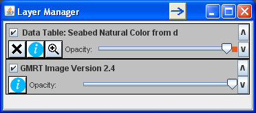
The
![]() item removes the
item removes the ![]() menu from the top of the GeoMapApp
window.
menu from the top of the GeoMapApp
window.
See
video tutorial on ![]()
![]()
6.1)
Arrow Cursor ![]()
Use the arrow cursor to select items on the map or items from loaded data tables.
When selected, click on the map and drag. This pan function offers an alternative to using the map scroll bars.
The map window image can be saved in a number of formats. Also, when a grid has been loaded, the grid can be saved in various formats. Equivalent to File > Save Map Window as Image/Grid File.
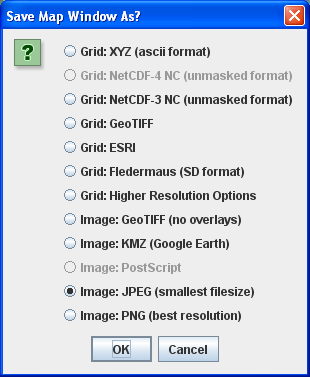
Figure:
Save options when a grid is loaded. If no grid is loaded, the four save-image
options are active as is the ![]() function that allows
the download of higher-resolution versions of the base map grid.
function that allows
the download of higher-resolution versions of the base map grid.
6.4)
Zoom ![]()
When
zooming in ![]() either click on the map or
click-and-drag the cursor to define a rectangle on the map. When zooming out,
click once the map for each zoom out operation.
either click on the map or
click-and-drag the cursor to define a rectangle on the map. When zooming out,
click once the map for each zoom out operation.
![]() Note: when the cursor
is in the map window, the ‘zoom factor’ is shown at the end of the tool bar
display values.
Note: when the cursor
is in the map window, the ‘zoom factor’ is shown at the end of the tool bar
display values.
For many base maps and grids in GeoMapApp, the maximum native resolution is achieved at a zoom factor of 512. That was chosen to be equivalent to a pixel size of about 100m which is a typical value for the cell size for gridded multibeam swath bathymetry data. Going beyond that value merely stretches the image making the pixels bigger.
However, a number of built-in grids and images have higher native resolutions and so can withstand further zooming. For example, in the continental United States, land elevations in the base map are derived from the 10m USGS NED data set and zoom factors of around 4,000 can be used to see stunning detail in the topography.
Additionally, some grids derived from scanning sonar devices attached to dive vehicles have resolutions on the order of a few meters or better. In those cases, the zoom factor can be very large (around 12,000) before pixilation becomes noticeable.
Take profiles across grids and find the distance between points using this function.
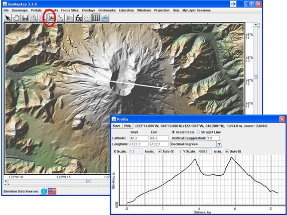
Figure: Topographic profile across Mt St. Helens. As the cursor is moved in the profile window, the cursor location is displayed on the profile track as a small red. Save options for the profile are listed under the Save menu.
6.5.1) Basic profile tool functionality
Selecting the profile tool from the toolbar automatically loads the underlying GMRT global digital elevation base map comprising ocean depths and land topography. The profile line is defined by two points. Click once in the map window to specify the start point. Keep the cursor depressed and drag the cursor to the desired end point. Release the cursor to draw the profile line. A profile window immediately opens.
Alternatively, start and end points can be specified in the profile tool window using the start and end field:
The default format of the start and end coordinates is decimal degrees but that can be changed to degrees and decimal minutes using the format drop-down menu:
When in degrees and decimal minutes format, the hemispheres (N,S,E,W) for the start and end point latitudes (N or S) and longitudes (E or W) must be defined as shown here:
Geographic
position (in formats of degrees-decimal minutes and decimal degrees) and elevation
are listed at the top of the profile window, along with the zoom factor.
![]()
To change the axes scaling, untick the Auto-fit box, and type a scale into the window. Hit enter for the scaling to take effect. In the following example, auto-fitting on the y-axis has been disabled and a manually-defined y-axis scale of 4000m/inch is specified.
By
default, the profile is taken along a great circle line. Choose between great
circle and straight line by selecting the radio button: ![]()
6.5.2) Create profiles across other grids
The default setting for the profile tool is to generate a profile across the GMRT digital elevation base map. Profiles can be taken across any other built-in or imported grid regardless of what type of data is represented by the grid. See such an example here.
6.5.3) Vertical Exaggeration
The profile is automatically exaggerated to fill the profile window. Defined as the x-axis scale divided by the y-axis scale, the vertical exaggeration (VE) is changed in one of three ways:
·
Type
a new VE value into the text box and hit enter: ![]()
·
Untick
the y-axis scale auto-fit box ![]() , enter a new scale
in the box
, enter a new scale
in the box ![]() and hit enter.
and hit enter.
·
Untick
the x-axis scale auto-fit box ![]() , enter a new scale
in the box
, enter a new scale
in the box ![]() and hit enter.
and hit enter.
6.5.4) Distance tool
When the Profile Tool is active, click the cursor and drag it around the map. The distance from the original location to the cursor’s current location is instantaneously displayed in the upper bar of the main map window (to the right of the zoom factor):
![]()
-------------------------
When the cursor is released, the end point of the profile line is defined and the profile window pops up.
Digitize points along the GMRT base map. Useful for cruise planning, for example.
See
video tutorial on ![]()
Select the digitizer tool. Two things happen: Various panels appear in the GeoMapApp window, and the base map GMRT grid is loaded (manifested as a change in the map colors).
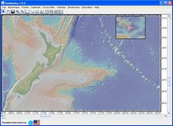
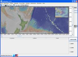
Figure: (Left) GeoMapApp base map zoomed in around New Zealand. (Right) When the digitizer is activated, the colors of the map change, a large empty panel appears below, and a narrow panel appears at right.
Expose the right-hand panel by dragging sideways the stippled grey vertical bar:
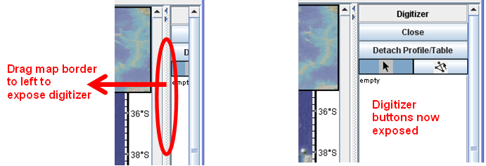
To
begin digitizing, click once on the line segment button ![]() .
The cursor becomes a cross-hairs (+). Click points on the map. To finish
digitizing, click the digitizer cursor button
.
The cursor becomes a cross-hairs (+). Click points on the map. To finish
digitizing, click the digitizer cursor button ![]() . The
line segments on the map turn white, with small squares at each digitized
point. The digitized points are listed in the table below the map.
. The
line segments on the map turn white, with small squares at each digitized
point. The digitized points are listed in the table below the map.
Figure: Digitized way points for a proposed cruise track leaving Wellington, crossing the Chatham Rise and heading towards the Louisville Ridge.
The digitized points can be saved by selecting all of the lines in the table below the map (they turn blue) and copy-pasting them with the mouse into another application such as Excel™.
Longitude Latitude Elev
175.07224805334877 -41.5625024954932 -142.0
179.3205924133214 -45.71779759422714 -2891.0
183.2452533934866 -41.8645310476485 -2815.0
186.8866914163203 -44.86389438923268 -3829.0
193.31989858999316 -40.494246229251 -5015.0
At
this stage in this example, only the five digitized points are registered. To
create a graphical profile of topography along the digitized line segments,
click Make Profile ![]() then click select
then click select ![]() . The profile appears in the lower
pane (use the scroll bar in the profile window to view the rest of the profile).
. The profile appears in the lower
pane (use the scroll bar in the profile window to view the rest of the profile).
The
profile is created by using interpolation to generate intermediate locations
between the digitized points and then sampling the GMRT grid at those interpolated points. The
amount of interpolation depends upon the zoom level of the base map. To view
the interpolated points, select ![]() . To save the listed points,
select all of the lines in the table and copy-paste with the cursor.
. To save the listed points,
select all of the lines in the table and copy-paste with the cursor.
Digitize
multiple profiles
To digitize a new set of points click again on the line segment button ![]() . Each set of digitized
points is stored in a separate line segments record until the GeoMapApp window
is closed.
. Each set of digitized
points is stored in a separate line segments record until the GeoMapApp window
is closed.
To
select previous digitized segments, click on the relevant line segments record ![]() In this way, multiple sets
of digitized points can be compared.
In this way, multiple sets
of digitized points can be compared.
The digitized points are lost when the GeoMapApp window is closed. Save them if they are needed for future use!
When a shapefile is loaded, the shapefile manager can be used to toggle the shapefile on and off, and, for multi-shape shapefiles, to select individual shapefile components.
In the image example, below, two multi-shape shapefiles are loaded. Select one by clicking its name in the left pane, then select in the right pane which individual shapefile component to view.
Figure: The multi-shape NOAA coastal grids shapefile is selected. Clicking the light bulb loads the grid for shapefile H10974. The multi-shape lakes shapefile, bc_2m_lakes, is also loaded. Click in the left pane to display its component shapefiles. Other examples of multi-shape shapefiles include built-in geographical boundaries data sets.
For
grid shapefiles, click the light bulb ![]() to open
the grid dialog
to open
the grid dialog 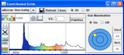 and click the zoom button
 ![]() to zoom on the area
covered by the shapefile. The information button
to zoom on the area
covered by the shapefile. The information button ![]() provides
additional on-line information on the data set. The shapefile can be toggled on
and off using the visibility buttons
provides
additional on-line information on the data set. The shapefile can be toggled on
and off using the visibility buttons ![]()
![]() . Discard the shapefile
using
. Discard the shapefile
using ![]() .
.
In
rare instances when the map view does not come into focus after zooming, click
the focus button ![]() to refresh the image.
to refresh the image.
See
video tutorial on ![]()
GeoMapApp’s
GMRT base map includes higher-resolution
bathymetry and land elevation data from a number of sources including a large
number of multibeam swath bathymetry data sets and regional grids, 10m USGS NED
land elevations, coastal grids, and under-ice data. Clicking the mask function ![]() applies a transparent mask to reveal
the location of this higher-resolution data. Semi-opaque grey areas indicate no
higher-resolution data was used in the GMRT tiles. Click the mask function button
applies a transparent mask to reveal
the location of this higher-resolution data. Semi-opaque grey areas indicate no
higher-resolution data was used in the GMRT tiles. Click the mask function button ![]() again to discard the mask.
again to discard the mask.
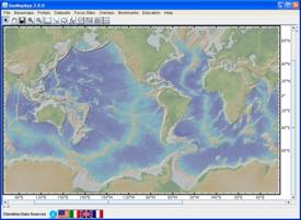
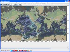

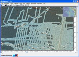
Figure: (Top row) The GMRT base map (left) and the location of higher resolution data used in its creation (right). (Bottom row) When zooming, some areas look ‘fuzzy’ or lacking in detail (left, an example on the East Pacific Rise). The mask function (right) reveals areas of multibeam data (transparent mask); the grey areas were not refined using multibeam data.
This shortcut loads the GMRT base map grid. Via the drop-down menu in the Global Grids window that pops up, it also allows other global grids to be quickly selected – click once on a grid name to load that grid.
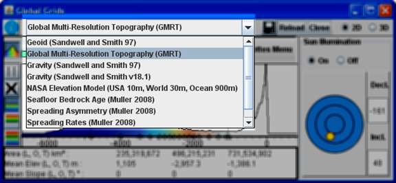
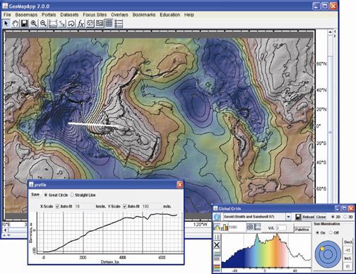
Figure: Global grid of geoid height anomaly (Sandwell and Smith, 1997), with ten-meter contours, and a profile showing the remarkable 180m geoid height anomaly between the Indian Ocean and Indonesia.
See the grid manipulation section for more information on grid functionality.
Use the functions in the Layer Manager window to turn layers on and off, change layer transparency (opacity) and layer ordering, and discard layers.
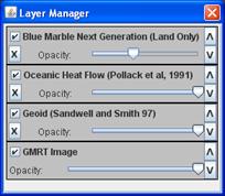
Turn
the on and off by ticking or unticking the display box (![]() ,
,
![]() ).
).
Bring
layers to the front by changing their order with the vertical arrows ![]() . Layer visibility can also
be controlled with the transparency function – see below.
. Layer visibility can also
be controlled with the transparency function – see below.
Click
the ![]() box to discard the layer.
box to discard the layer.
6.11.1) Layer transparency
Slide
the Opacity slider bar (![]() ) to the left and right to alter
the layer transparency. That allows convenient comparison with features on other
layers. When the slider bar is all the way to the right the layer is opaque and
so is fully visible. As the slider bar moves to the left, the layer becomes
more transparent thus allowing other layers to become visible.
) to the left and right to alter
the layer transparency. That allows convenient comparison with features on other
layers. When the slider bar is all the way to the right the layer is opaque and
so is fully visible. As the slider bar moves to the left, the layer becomes
more transparent thus allowing other layers to become visible.
Many icons and table column headings contain active tooltips. Allow the cursor to linger over the item for a second or two to see the associated tooltip.
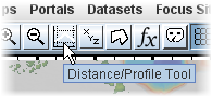
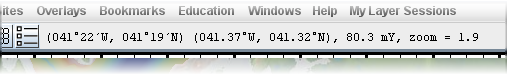
The displayed text varies with three cases.
Case 1: No grid loaded (default view, or when images are loaded)
![]()
From left to right, the text in this example shows:
Longitude in whole degrees and decimal minutes, East or West (range is 0-180).
Latitude in whole degrees and decimal minutes, North or South (range is 0-90).
Longitude in decimal degrees, East or West (range is 0-180).
Latitude in decimal degrees, North or South (range is 0-90).
Zoom factor. This number indicates how far in we have zoomed. A zoom factor of 1 corresponds to the global view. For those interested, a zoom factor of 512 is the zoom level at which a 100m gridded data set can be viewed without obvious detrimental image pixelation. The USGS NED land elevation data set used in the GMRT base map has a resolution of 10m in the conterminous US and zoom factors of 2048 or 4096 still offer good detail. Ultra-high-resolution grids at hydrothermal vent sites (some with grid cell size of just 25 cm!) can withstand even higher zoom factors, up to tens of thousands.
Case 2: Grid loaded
![]()
Same as case 1, but now shown to the right of the geographic location is the z value of the grid at the cursor location (-2733m in this example, 80.3 mY in the snapshot example shown at start of section).
For many grids, the native grid resolution may support large zoom factors.
Case 3: Profile tool activated (grid is loaded)
![]()
Same as case 2, but now shown to the right of the zoom factor is the distance from the start of the profile to the current position of the cursor (418.45 km in this example). The Profile Tool thus provides a convenient distance-measuring function.
A
range of short video tutorials is available on the GeoMapApp channel on ![]()
The tutorials can be viewed in any web browser.
10.1) How to Import Data – Spreadsheets
See
video tutorial on ![]()
In addition to ASCII data tables, spreadsheets in Excel .xls and .xlsx format can be imported to GeoMapApp.
Figure: Example spreadsheet called TicoFlux2_Processed_Heatflow.xls contains NSF MARGINS-funded heat flow data collected by Andy Fisher in central America.
The spreadsheet must contain a column for longitude (in decimal degrees between +/- 180) and a column for latitude (in decimal degrees between +/- 90). The first row of the spreadsheet is expected to be column headings.
Spreadsheets containing dozens of columns can be imported successfully. Also, those containing simple formulae generally can be imported. If a spreadsheet fails to import, try converting it to a tab-, comma- or pipe-separated ASCII file and then use the appropriate ASCII table import option in the same menu. Note also that the old Excel 5.0/95 (BIFF5) format is no longer supported.
Select the import function:
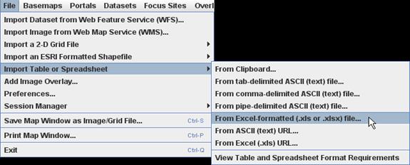
Locate the file and Open it. After GeoMapApp reads the contents of the file, a Config window appears.
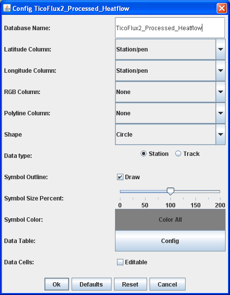
GeoMapApp searches for a latitude and longitude column heading (it can recognise “Latitude”, “latitude”, “lat”, for example). If no match is found, the latitude and longitude columns must be specified in the Config window. Open the drop-down menu for Latitude Column and select the latitude column from the list. In this example, it is “Pen_Latitude”.
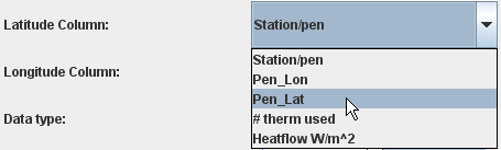
Similarly,
select the longitude column. Click ![]() .
.
When loading a tabular data set, the symbol color can be defined. Click the Color All button:
![]()
In the Color Chooser window, drag the horizontal bars up and down to select a color. Hit OK to apply the color. Note that the color applies to all symbols. See lower down in this section for details on how to color symbols individually.
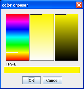
The
shape of symbols is chosen under the ![]() menu. Like the
symbol color, it applies to all symbols.
menu. Like the
symbol color, it applies to all symbols.
Once the parameters have been set, hit the OK button to import the tabular data set. Two things happen. First, the symbols are plotted on the map and second, a table appears beneath the map.
If there are no symbols on the map and no records beneath the map, it is likely that the geographical area displayed in the map window does not include the area covered by the imported data set. So, zoom out until the symbols and table are shown.
The table displays the contents of the imported data records for all locations that fall within the boundary of the map window.
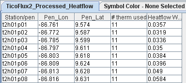
Widen the columns by clicking on the column border and dragging the double-headed arrow cursor.
![]()
A panel containing function buttons appears on the right side of the map.
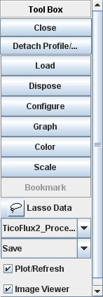
To color the symbols
individually, there are two ways to proceed: interactively using the ![]() button or manually be including a
column of Red,Green,Blue values in the imported file.
button or manually be including a
column of Red,Green,Blue values in the imported file.
For
the first way, click ![]() and choose a parameter on which to
color (e.g. by heat flow value). The color histogram window shows the selected
value along the x-axis and the number of values on the y-axis. Drag the
vertical grey lines sideways with the cursor (double-headed arrow) to change
the color range.
and choose a parameter on which to
color (e.g. by heat flow value). The color histogram window shows the selected
value along the x-axis and the number of values on the y-axis. Drag the
vertical grey lines sideways with the cursor (double-headed arrow) to change
the color range.
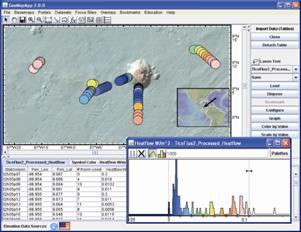
For the second way, a specific color can be defined within the imported file by creating one column that contains Red,Green,Blue comma-separated values. For example, to define a record’s symbol as yellow, the RGB value for it would be 255,255,0.
Change
the symbol Shape with ![]() Choices are: Circle,
square, star, triangle.
Choices are: Circle,
square, star, triangle.

10.2) How to Lasso Data Points
When
tabular data is loaded, click the lasso tool ![]() to activate the
selection function. Move the cursor to the map window, click and hold the cursor
button, and draw around the points of interest.
to activate the
selection function. Move the cursor to the map window, click and hold the cursor
button, and draw around the points of interest.
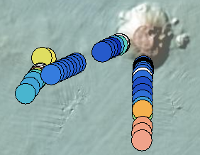
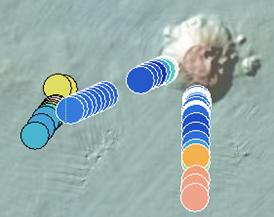
The selected points are highlighted in white on the map, and in blue in the data table below the map window.
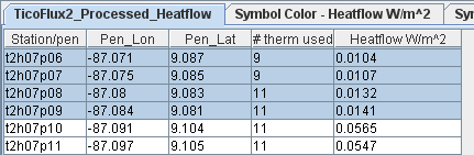
Save these chosen points in a range of formats using the right-pane Save function.
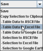
10.3) How to Import Data – Grids
See
video tutorial on ![]()
Gridded data sets can be imported in GeoMapApp as long as the grid is in one of these formats: GMT netCDF , ESRI ASCII or binary , Geodas GRD98 or ASCII Polar (.asc).
Multiple grids can be imported at once, as shown in the example below. In this case, the multiple grids must reside in one folder.
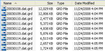
Figure: List of netCDF grids constructed from JAMSTEC research vessel Kairei processed multibeam swath bathymetry data collected in 2003.
Activate the import-grid function:
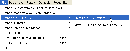
Specify the grid type from the drop-down menu and click OK:
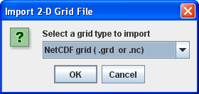
In the file system navigation window, navigate to the folder containing the grids
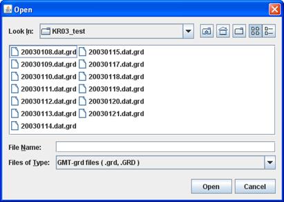
Use the cursor (shift-click) to select all of the grid files. (To import just one grid, select that grid file name only.) The file names turn blue.
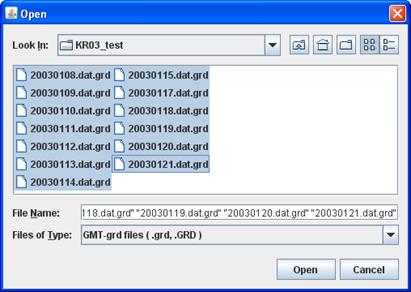
Click
![]()
A Confirm Projection and Bounds window appears:
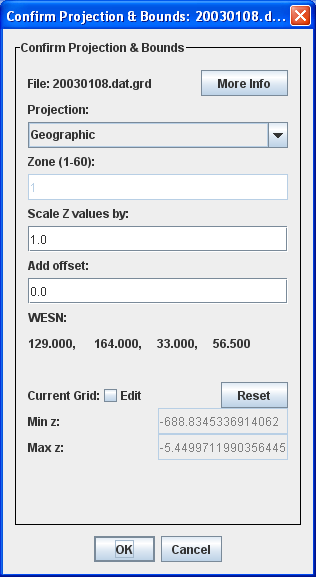
As
part of the import process, the gridded Z values can be scaled by any factor using
the ![]() option. This is useful for
switching depths from positive downwards to negative downwards, for example.
Further, to avoid having to manually scale each of the grids to be imported,
tick the
option. This is useful for
switching depths from positive downwards to negative downwards, for example.
Further, to avoid having to manually scale each of the grids to be imported,
tick the ![]() box – the scaling factor
will then be applied automatically to all grids.
box – the scaling factor
will then be applied automatically to all grids.
Click
![]()
As each grid is processed, its status is shown in the Import Grid window.
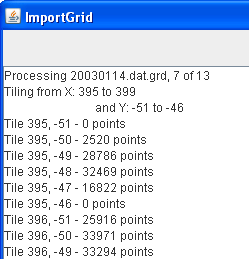
When all of the grids have been processed the folder containing the grids now includes a set of z-folders and a suite of shapefile components. These new files and folders should not be discarded at this stage - the shapefile allows the imported grids to be accessed instantly at a later date, and the z-folders allow zoom capability.
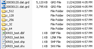
Two new GeoMapApp windows appear – a grid dialog and a shapefile manager – and the map window zooms automatically to the gridded area.
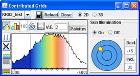
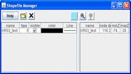
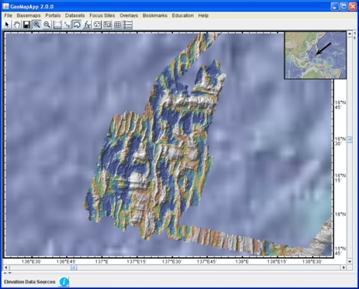
The wide range of GeoMapApp grid manipulation functions can now be applied to these imported grids – changing the color palette, sun illumination, vertical exaggeration, adding contours, taking profiles, overlaying imported data points, saving images, and so on.
If you would like your grid to be built into the GeoMapApp base map or the GeoMapApp menus, please contact us.
Note
that imported grids are loaded for the current GeoMapApp session only. Not to
worry: if GeoMapApp is closed, the grids can instantly be reloaded by importing
the shapefile under the ![]() menu:
menu: ![]()
See
video tutorial on ![]()
When any grid is loaded, two windows pop up: the grid dialog window (shown at left, below) and the Layer Manager (shown at right, below).
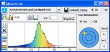
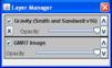
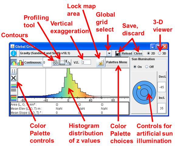
In the grid dialog window, the histogram shows the relative distribution of gridded z-values for the map area displayed in the map window. For example, for a relatively flat area, the color histogram will show a narrow distribution of gridded z-values. In contrast, a map area that includes a wide range of z-values will yield a histogram that is broad.
The
color scale is automatically adjusted so that the palette spans the full range
of gridded z-values displayed in the map. To change the span of the colors,
drag the two thin, grey vertical lines to the left or right – the cursor will
become a double-headed arrow that can be dragged. The map will refresh
instantly with the new range of colors. Reset the color range to the default by
clicking the normalizing button ![]() . The
chosen limits can be locked with the
. The
chosen limits can be locked with the ![]() button.
This preserves the limits when the map window is zoomed or panned.
button.
This preserves the limits when the map window is zoomed or panned.
The
“ocean palette” button ![]() is a shortcut to a color
palette suitable for z-values between 0 to about -8000 (typical ocean depth
ranges). The “land palette” button
is a shortcut to a color
palette suitable for z-values between 0 to about -8000 (typical ocean depth
ranges). The “land palette” button ![]() is a
shortcut to a color palette suitable for z-values between 0 to about +6000
(typical land elevations). The
is a
shortcut to a color palette suitable for z-values between 0 to about +6000
(typical land elevations). The ![]() button switches to the
default palette that spans both positive and negative ranges. The continuous
rainbow button
button switches to the
default palette that spans both positive and negative ranges. The continuous
rainbow button ![]() spreads the color scheme
uniformly across the z-range of the grid. Discrete color changes are specified
with the bar chart button – specify the increment for the color change
boundaries by typing in the associated text box:
spreads the color scheme
uniformly across the z-range of the grid. Discrete color changes are specified
with the bar chart button – specify the increment for the color change
boundaries by typing in the associated text box: ![]() .
.
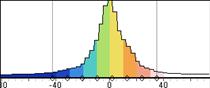
Click
the ![]() button to choose different
color palettes or to create or save a custom palette.
button to choose different
color palettes or to create or save a custom palette.
In all palette-related functions, two thin grey vertical lines displayed in the histogram window can be dragged left or right to change the colors.
The right-side of the grid dialog window controls the artificial sun illumination of the grid display. Change the illumination angle and brightness by dragging the yellow sun symbol. Precise illumination angles can be specified by typing degree values into the text boxes.
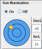
The
intensity of shading is determined by the vertical exaggeration which is
specified in the ![]() box.
box.
To
lock the area displayed on the map, click the padlock symbol ![]() . That is useful if additional data
sets with different bounds are loaded.
. That is useful if additional data
sets with different bounds are loaded.
Switching
between the ‘below zero’ ![]() , ‘above zero’
, ‘above zero’ ![]() and ‘continuous’
and ‘continuous’ ![]() color palette buttons
allows different z-ranges of the grid to be colored and shaded independently.
For example, that can be useful for applying different coloring/shading settings
to a map display that includes ocean floor depths and land elevations.
color palette buttons
allows different z-ranges of the grid to be colored and shaded independently.
For example, that can be useful for applying different coloring/shading settings
to a map display that includes ocean floor depths and land elevations.
The
![]() button switches the histogram between
the distribution of elevations (or whichever z value is represented in the
grid) and the distribution of gradients.
button switches the histogram between
the distribution of elevations (or whichever z value is represented in the
grid) and the distribution of gradients.
To
draw contours on the grid, click the contour ![]() button to
open a contour parameters box.
button to
open a contour parameters box.
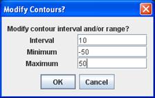
Specify
the contour interval and the maximum/minimum values to be contoured. When the ![]() button is clicked, the
contours are processed on the local CPU and displayed on the map. The contours
can be turned off by clicking the contour button again.
button is clicked, the
contours are processed on the local CPU and displayed on the map. The contours
can be turned off by clicking the contour button again.
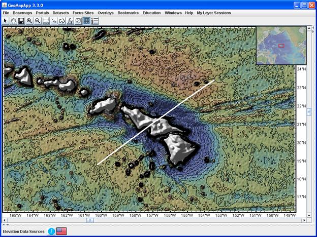
Figure: Hawaiian islands free-air gravity anomaly grid with contours displayed at 10mGal intervals. An upper contour limit of 100mGal was imposed. The white line is the location of the profile, shown below.
With
any grid loaded, profiles are generated using the profile function ![]() . Once clicked, the cursor
becomes active as a profiling tool. Drag the cursor across the map window to
draw a profile line.
. Once clicked, the cursor
becomes active as a profiling tool. Drag the cursor across the map window to
draw a profile line.
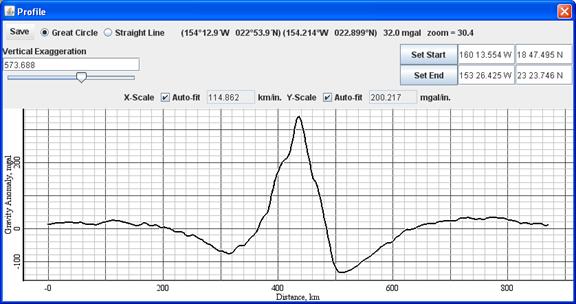
Figure: Flexural moats around the Hawaiian islands shown in this profile of the Sandwell-Smith satellite-derived free-air gravity anomaly.
In
the grid dialog window, click the information button (![]() in the upper left) to open a web page with more information about the loaded
grid.
in the upper left) to open a web page with more information about the loaded
grid.
To
reload or discard the grid, click the ![]() buttons.
buttons.
The
grid that is visible in the map can be saved in many different formats using
the save button ![]() . The map can also be saved
as an image.
. The map can also be saved
as an image.
Most
of the grid-save options will save the grid at the resolution of the map
window. However, a range of grid resolution options is now available when the
following item is selected:![]()
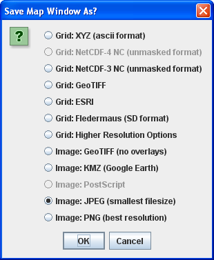
The
grid can be viewed in 2-D or 3-D, controlled with the ![]() selection.
When
selection.
When ![]() is selected, a 3-D
perspective viewing window is opened. It shows a low-resolution version of the
grid and allows various parameters to be altered.
is selected, a 3-D
perspective viewing window is opened. It shows a low-resolution version of the
grid and allows various parameters to be altered.
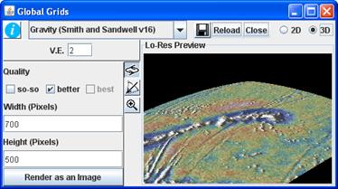
Rotate
the grid using the ![]() button (drag cursor left
or right in the preview image). Tilt the surface with
button (drag cursor left
or right in the preview image). Tilt the surface with ![]() (drag
cursor up or down in the preview image). Zoom in or out with the zoom
(drag
cursor up or down in the preview image). Zoom in or out with the zoom ![]() button (in preview image,
drag cursor to the right to zoom out, and to the left to zoom in). Change the
vertical exaggeration by typing the factor into the
button (in preview image,
drag cursor to the right to zoom out, and to the left to zoom in). Change the
vertical exaggeration by typing the factor into the ![]() box.
Specify the pixel size of the fully-rendered image – the default 700 x 500
pixels works well with most laptop screens). Click
box.
Specify the pixel size of the fully-rendered image – the default 700 x 500
pixels works well with most laptop screens). Click ![]() to
produce the full-resolution 3-D perspective plot.
to
produce the full-resolution 3-D perspective plot.
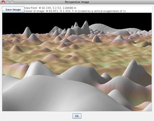
10.5) How to use the Layer Transparency
Layer transparency can be changed to allow other layers to become visible. This is very useful for comparing data sets in different layers. In the following example involving the Hawaiian islands, we compare satellite-derived free-air gravity anomalies and bathymetry, with a view to studying lithospheric flexure.
Zoom to the Hawaii region and load a FAA gravity data set.
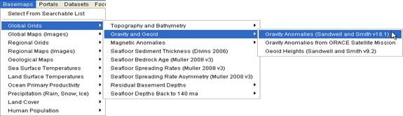
In
the Layer Manager window, toggle the gravity data set off and on by
unticking/ticking the ![]() ,
, ![]() box.
box.
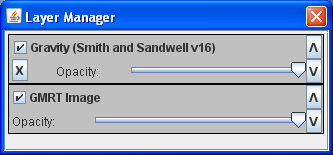
Slide
the Opacity slider bar (![]() ) to alter the
transparency of the layer. When the bar is all the way to the right the layer
is opaque. As the slider bar is moved to the left, the layer becomes
increasingly transparent allowing the other layers to become visible. When the slider
bar is all the way to the left (equivalent to unticking the
) to alter the
transparency of the layer. When the bar is all the way to the right the layer
is opaque. As the slider bar is moved to the left, the layer becomes
increasingly transparent allowing the other layers to become visible. When the slider
bar is all the way to the left (equivalent to unticking the ![]() box), the layer is
completely transparent (invisible) and the underlying layer is fully visible. Click
the discard box
box), the layer is
completely transparent (invisible) and the underlying layer is fully visible. Click
the discard box ![]() to discard the layer.
to discard the layer.
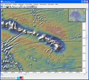
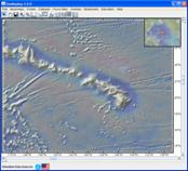
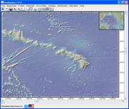
Figure: (Left) Layer is opaque and fully visible. (Middle) As opacity decreases, the underlying GMRT bathymetry becomes visible. (Right) When fully transparent, the original layer is no longer visible, allowing the GMRT layer to be displayed fully.
10.6) How to Import Data – Shapefiles
See
video tutorial on ![]()
Shapefiles usually comprise a number of component files. To import a shapefile to GeoMapApp, the following component files must be present: .shp, .shx, .dbf.
Activate the import-shapefile function:
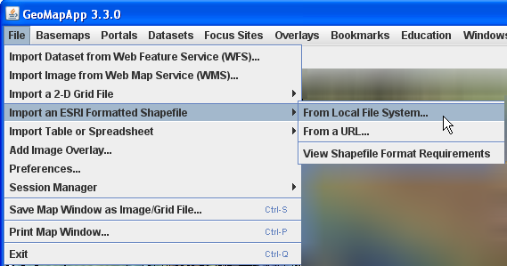
Navigate to the folder containing the shapefile component files and check that the .shp, .shx, .dbf are present. In this example, a shapefile contains the outlines of lakes at 2m resolution for British Columbia.
Select the .shp file (![]() ) and click
) and click
![]()
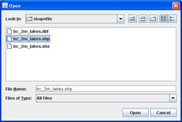
A Shapefile Manager window appears. The shapefile contents are listed in the right panel of the Shapefile Manager, and the layer is displayed on the map.
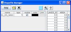
In the right panel, click on an item in the list to highlight that feature – on the map, the feature turns white.
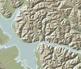
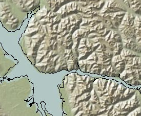
Figure: Close-up of British Columbia lake outlines. (Left) Shapefile component is selected (highlighted in white). (Right) Item is de-selected (outlined in black).
10.7) How to Import Data – Shapefiles of grids
When grids are imported to GeoMapApp, the import procedure automatically generates a shapefile of the grid. This shapefile can be imported at a later date without having to re-import or re-process the original grid.
Follow the steps above for importing shapefiles. Since the shapefile content is a grid, the grid dialog window also appears.
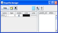
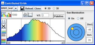
10.8) How to use the Tear-Off Menus, and search
Sometimes, navigating the GeoMapApp cascading menus can be frustrating if the item of interest is embedded deep within the menu structure. Tear-off menu functionality can help. It generates a simple menu navigation window that remains open and active throughout a GeoMapApp session. It also offers search capability.
Tear-off menus are available for the Basemaps, Portals, Datasets, Focus Sites and Overlays menus.
To
activate the tear-off menu function, click ![]()
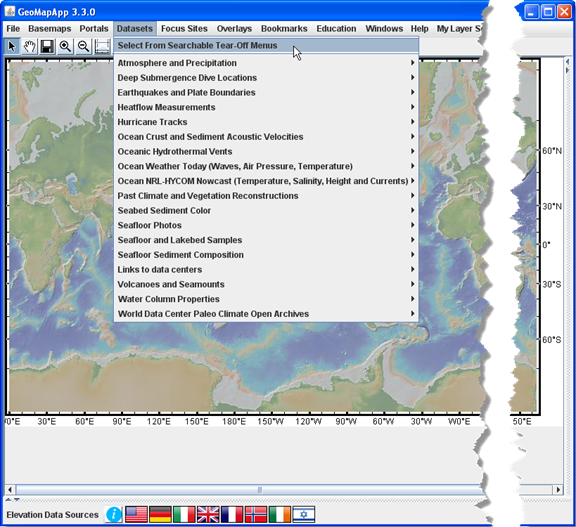
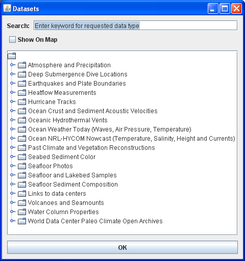
In
the menu navigation window, open a folder by either double-clicking the folder
symbol (![]() ) or clicking the turn-down
widget (
) or clicking the turn-down
widget (![]() ).
).
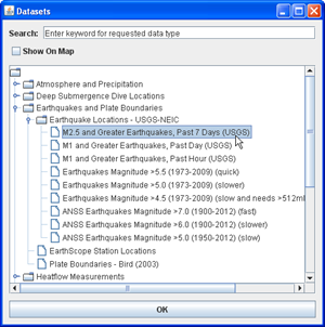
To
load an item, select it from the menu listing and click the ![]() button.
button.
Tear-off menus also allow folders to be opened in separate navigation windows. Drag the folder out of the navigation window. The folder instantly opens as a menu in a new, active window. Sub-folders are again active.
To
search for a particular data type within each main GeoMapApp menu category,
enter a key word in the tear-off menu textbox and hit the Enter key. In the
example shown below, the Data sets tear-off menu is open and a search for data
types related to “temperature” highlights all of the resultant menu items.
Click one of the menu items and the ![]() button to
load it in the map window.
button to
load it in the map window.
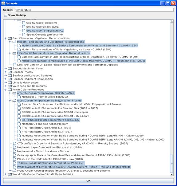
If no results are found, try searching under another main GeoMapApp menu category such as Basemaps or Overlays.
10.9) How to move/sort tabular columns
With any tabular data set loaded, the order of columns can be changed by clicking on the column header and dragging the column left or right. The rows within a column can be sorted in ascending or descending order by clicking once on the column header.
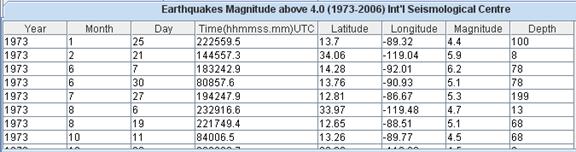
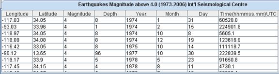
Figure: For this ISC data set, the original configuration of the tabular data is shown in the upper panel. Beneath it, the latitude, longitude, magnitude and depth columns have been moved to the left, and the magnitude column has been sorted in ascending order.
10.10) How to Detach or Re-Attach Tables
When
any tabular data set is loaded, click ![]() in the
upper right. This detaches the table, allowing the map window to become larger
and the self-contained table to be moved around the screen.
in the
upper right. This detaches the table, allowing the map window to become larger
and the self-contained table to be moved around the screen.
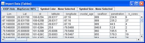
Example of free-floating, detached table, in this case for the IODP web feature service.
Click
![]() to re-connect the table to
the map window.
to re-connect the table to
the map window.
11.1) Loading data sets with many points
Due to memory limitations with some older computers, GeoMapApp implements a decimation scheme when loading large data sets. For this, all of the data points are first read from the data set. Then, they are decimated based upon their geographical distribution. In any given GeoMapApp map display, up to 10,000 points from the geographically-decimated data set are displayed. Do not worry – the other points have not been lost. Instead, as a user zooms to an area, more points (up to 10,000) are displayed.
The
following notice appears when the decimation process is active. Click ![]() to proceed with loading.
to proceed with loading.
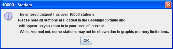
A number of compelling GeoMapApp images are available via MGDS MediaBank which can be accessed via the Image Gallery link on the GeoMapApp web page.
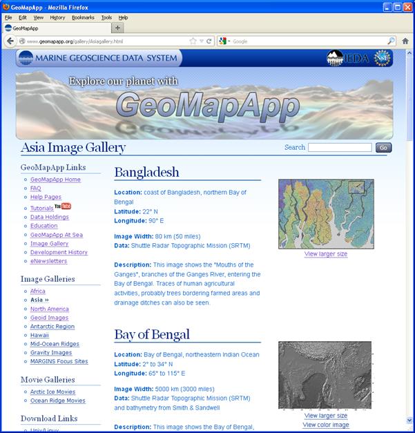
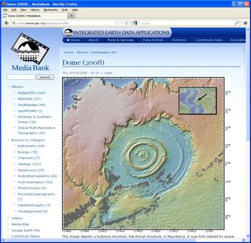
11.3) GeoMapApp Built-In Data Sets
GeoMapApp offers a very wide range of built-in data sets covering a broad array of geoscience fields. A simple web page allows the data set listings to be viewed in a browser: http://www.geomapapp.org/dataholdings/index.php
Example of holdings under the Data Sets menu:
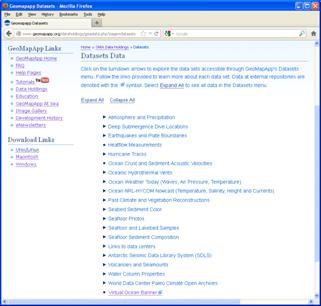
11.4) Contact us, and the GeoMapApp listserv
Questions about GeoMapApp, as well as suggestions for improvements and notification of any bug, should be sent to info@marine-geo.org
To join the GeoMapApp mailing list, go to the Mailing List link under the Help menu.